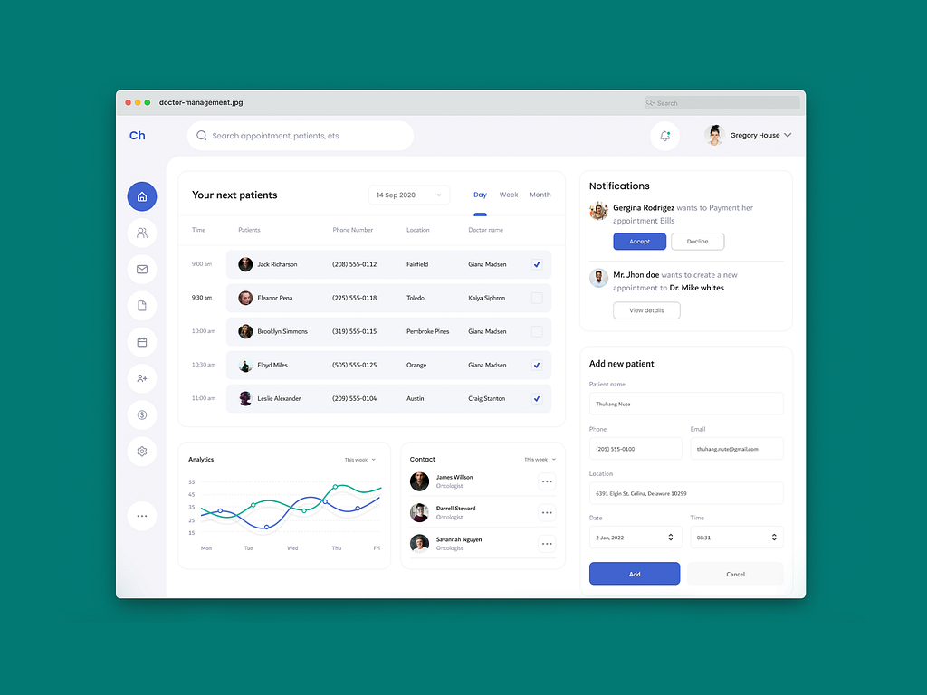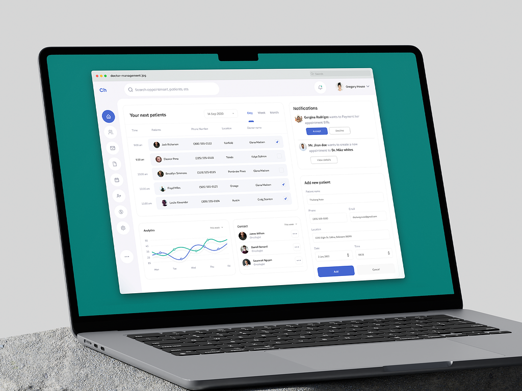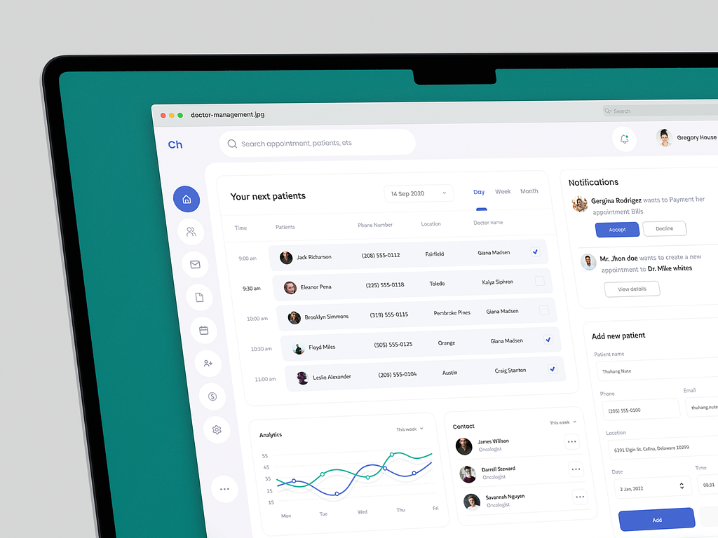
This project case study is about designing a management system dashboard. The objective was to improve efficiency, show important insights, and streamline the overall work process.
The client was a mid-sized private practice with a group of doctors, nurses, and administrative staff.

Lack of uniformity: The client relied on separate platforms to keep track of appointments, payments, and notifying doctors about their appointments. They needed to bring it all together in one place.
Inefficient scheduling: Appointment scheduling lacked clear visualisation, leading to potential double-booking and patient wait times.
Disorganised communication: Notifying and contacting each other was a clustered, complicated process that depended on multiple third-party applications.
I designed the interface that the client needed.
Easy data visualisation: The new dashboard shows real-time and historical data on appointments, schedules, notifications, and analytics.
Efficient scheduling: Scheduling appointments is made easier with a simple form that takes in the necessary and relevant information.
Better communication: There are distinct and organised sections dedicated to providing notifications regarding appointments and payments and also to communicating with other doctors.

The new dashboard has decreased scheduling conflicts and double bookings. It has significantly improved overall communication and efficiency. Keeping track of the entire work process has become easier and faster.
If you need the perfect website that delivers the best user experience while maintaining your brand image, feel free to contact me.
PREVIOUS PROJECT
Sound Editing Web ApplicationNEXT PROJECT
Agency Dashboard Design