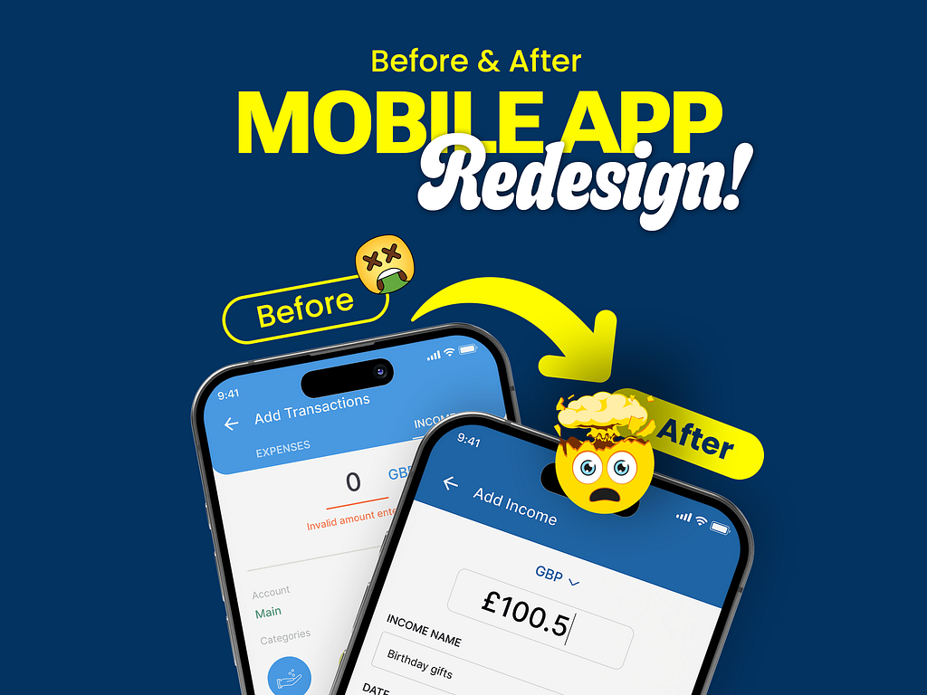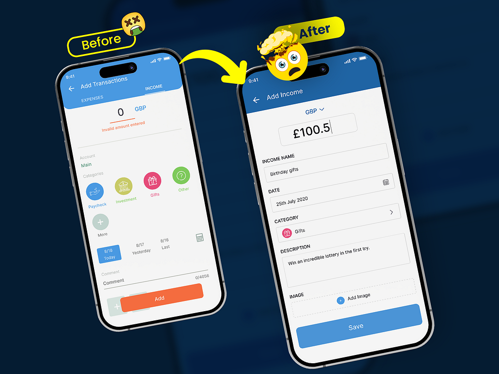
For this project, I worked with a client who needed a more efficient and user-friendly interface for their financial management application, specifically focused on simplifying the income entry process. The client’s primary goal was to reduce user confusion and improve the overall user experience by streamlining the data entry form and ensuring the process was as intuitive as possible.

Challenges:
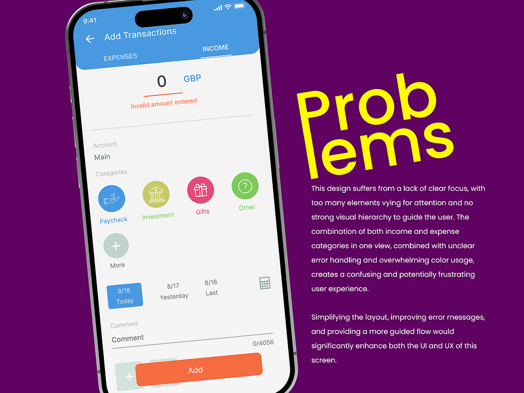
Cluttered Interface: The original design had too many elements competing for attention, leading to a confusing user experience.
Poor Visual Hierarchy: Users were struggling to understand the flow of the form, making it difficult to enter data efficiently.
Error Handling: The initial design's error messaging was easily overlooked and didn't effectively guide users to correct mistakes.

Clutter Reduction:
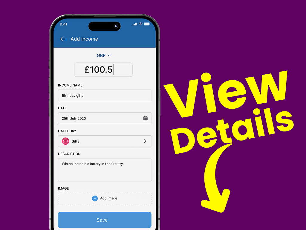
Streamlined the interface by focusing solely on income entry, removing unnecessary elements and categories. This reduced the clutter and made the form more straightforward.
Improved Visual Hierarchy:
Introduced a clear, step-by-step flow with well-defined sections (e.g., amount, income name, date, category, description), guiding the user naturally through the form.
Enhanced Error Handling:
The design avoids common input errors by ensuring each field is clearly labeled and visually distinct, reducing the need for error messages and improving form usability.
Focused User Flow:
Simplified the user flow by focusing the design on a single task—adding income—thus reducing confusion and making the process more intuitive.
Visual Engagement:
Used consistent, minimalistic design elements, such as icons and input fields, to create a visually appealing and user-friendly experience without overwhelming the user.
Accessibility Improvement:
Positioned the "Save" button prominently at the bottom with ample space around it, making it easier to tap and ensuring it’s clearly recognized as the primary action.

PREVIOUS PROJECT
Kids Smartwatch - Parent Companion AppNEXT PROJECT
Real-Time Stock Trading Dashboard Mobile UI Design