Fittrack already had cool app design then why did they hire me?
Every redesign project that comes to me can have either of these two problems. One, the design is too old and doesn’t go anymore. Two, the design is good but it’s creating some performance issues. Kate, a product manager at Fittrack, saw my Behance profile and booked a meeting to talk about possible solutions.
The Fittrack fitness app had been slowing down and it was partially because of the design. Plus Fittrack wanted to update the UI with more user-friendly features.
For the new design, I suggested a minimalist approach that would improve responsiveness, reduce load time, and work faster. Along with it, a default dark theme would improve battery life, readability and user interactions.
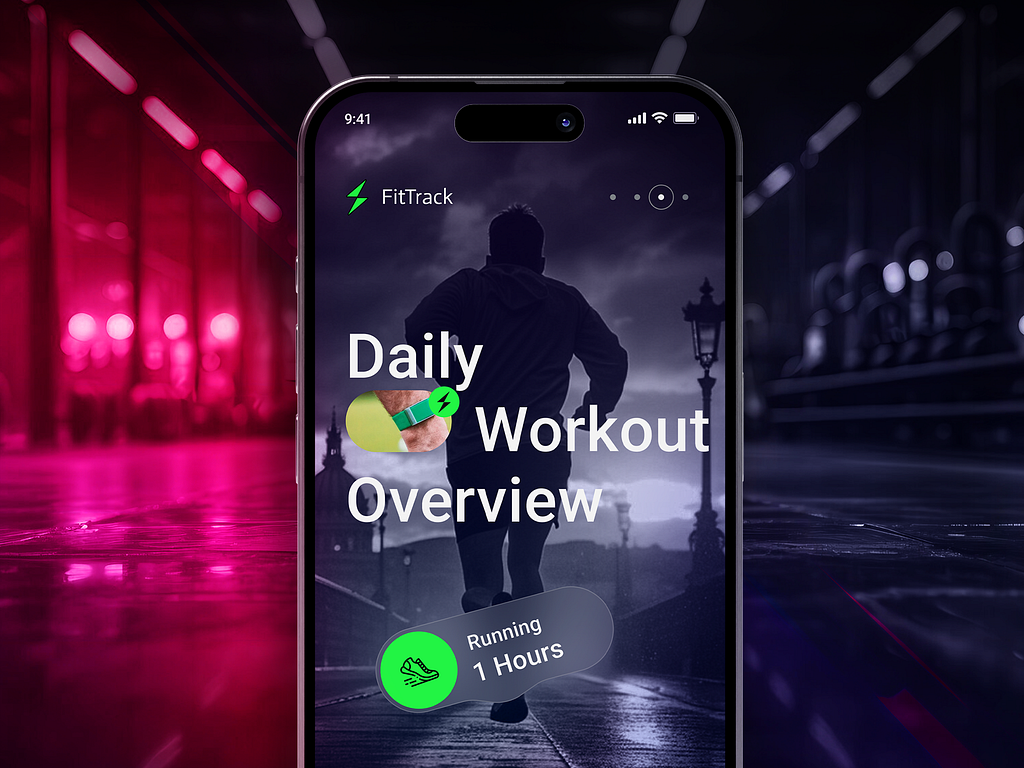
For the new UI, we decided that it would have a less congested screen with fewer, more important elements. The app would also have updated onboarding/introduction screens highlighting aspects of the user’s workout activity overview.
Clean and minimalist style
But why a minimalist style? For designers and developers, the answer is pretty clear. The less complex the design is, the less time it takes to load. This improves the overall performance. Plus, a clean UI looks more modern and users prefer it over a cluttered screen that makes them confused.
The clean and minimalist UI design focusses on essential elements, a limited colour palette, ample whitespace, and clear typography to improve readability and balance.
Colour Choices
In every design project, the colours are crucial. Getting the right palette can change the entire look of a project. For a fitness app where people would on average spend 1-2 hours a day almost every day, the design has to be as user-friendly as possible.
That’s why, during our first meeting, I convinced Kate to try a default dark theme.
Let’s be honest, almost all of us have quit our fitness journey once or twice (or a few more times) in our lives. Fittrack understands the importance of continuity in the success of fitness goals. So these new screens will show the users their daily activity overview with a compelling image that would motivate them to be consistent.
Clutter-free and User-friendly
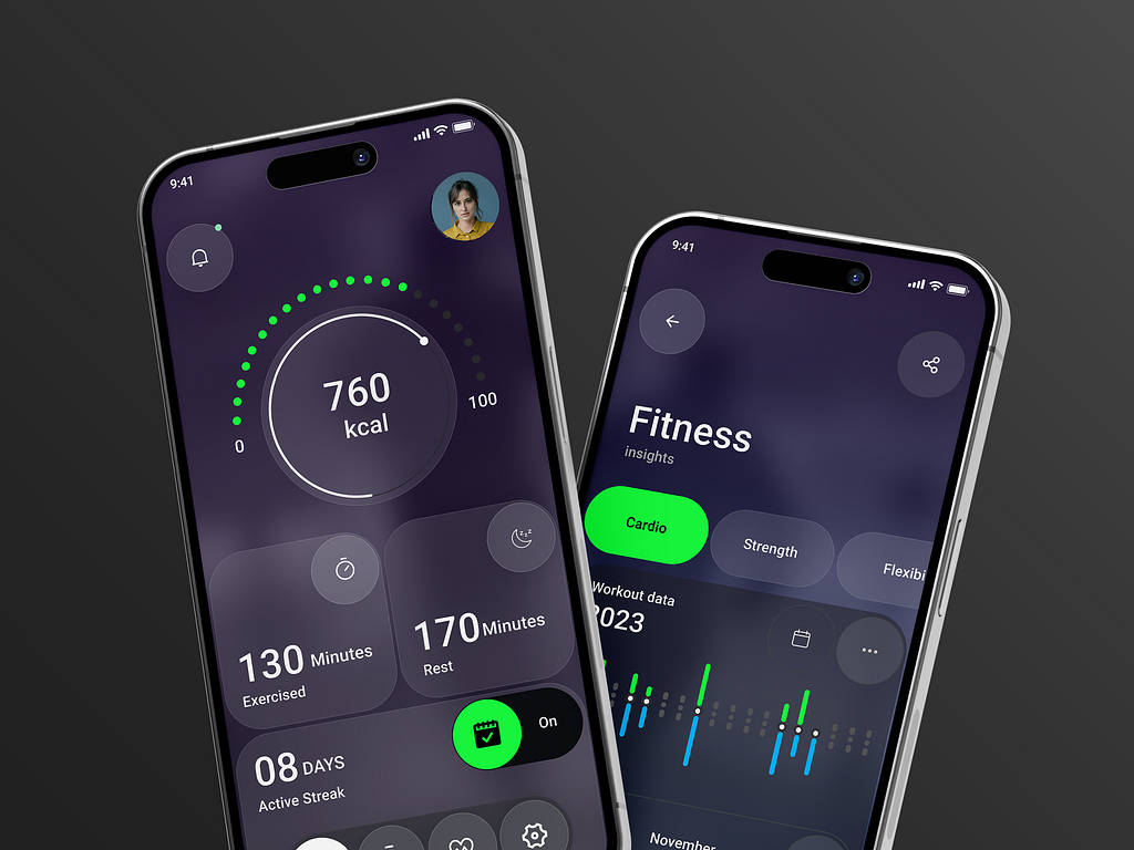
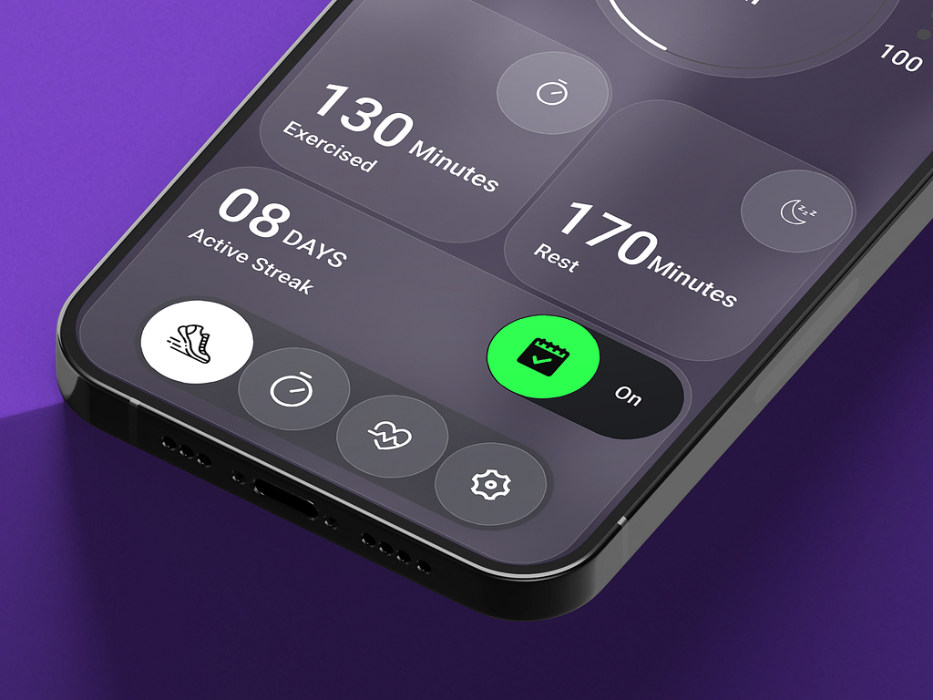
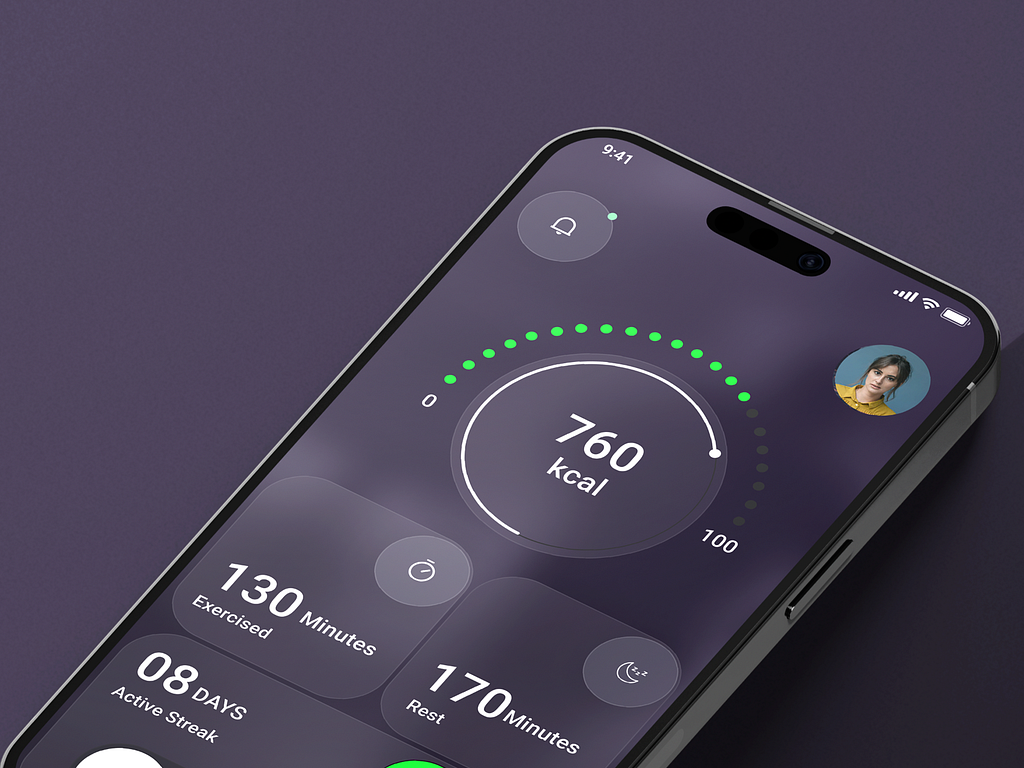
To downsize from the complex design, the Fittrack team and I prioritised features that were genuinely helpful. That’s why the homepage shows a metric of total calories burned and total time spent exercising and resting. Because you cannot continue without the help of a proper diet, exercise and sufficient rest. In the bottom, users can see their activity streak as well.
Why a Dark Theme?
The green colour of the Fittrack logo works amazingly on this background. It is the perfect accent colour and green also reminds us of health and growth, making it ideal for a fitness app.
New Feature
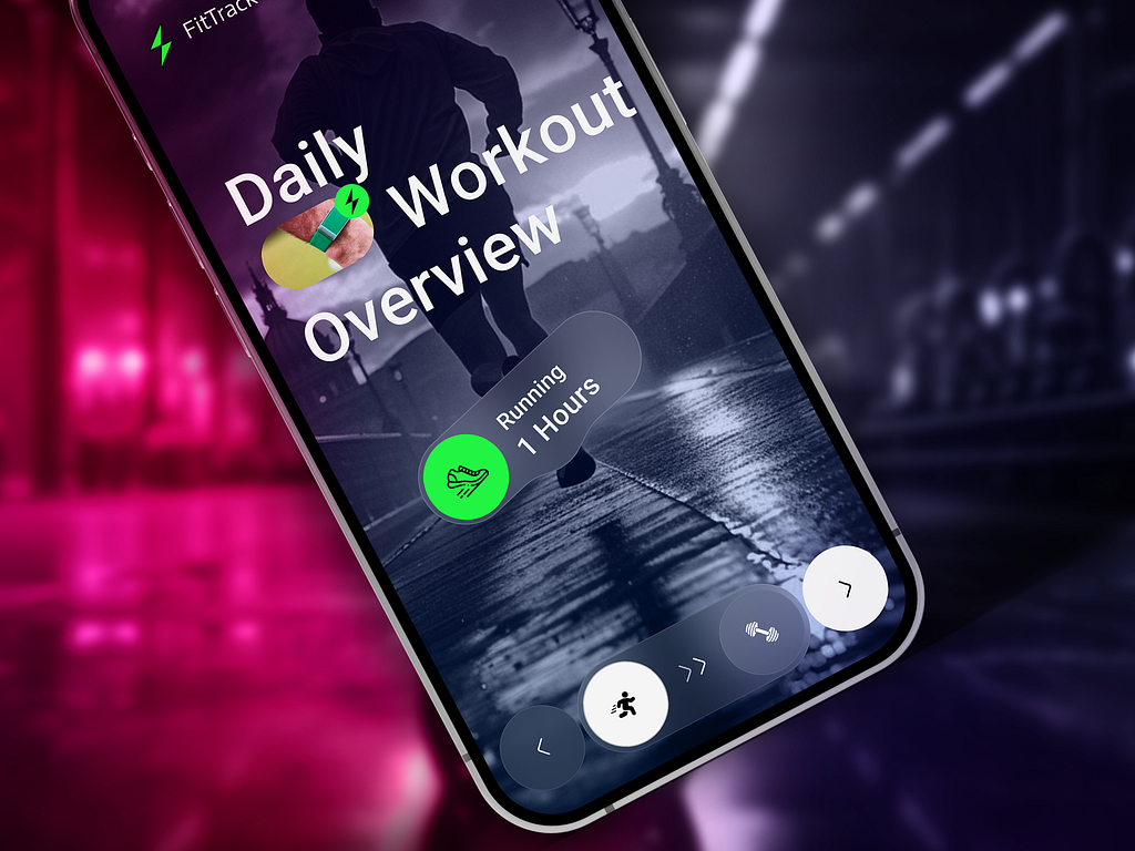
A new feature was introduced in the app during this project— a carousel of onboarding/introductory screens that show daily workout overview.
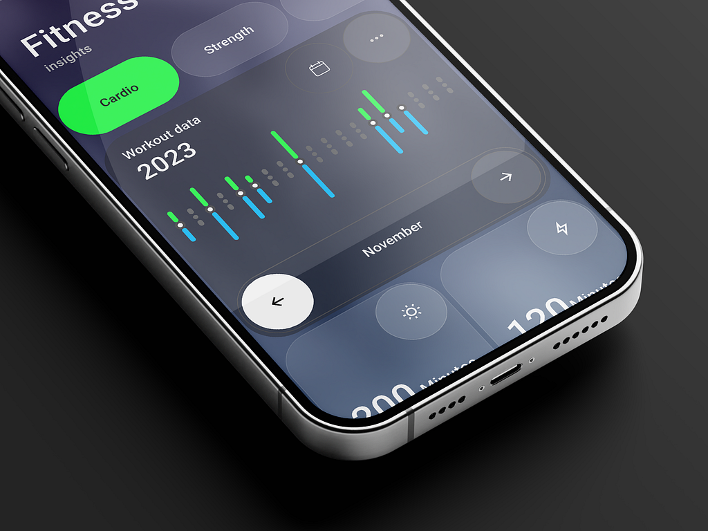
But certainly the users need more insight to get a better picture of their growth. That’s why the detailed insights are located on a separate page. The bar chart with colour-coding makes data visualisation clear and efficient. On the dark background, these details and insights are easily readable. The green accent colour highlights buttons that show the data of specific types of exercises like “cardio”, “strength” etc.
Use of Glass Morphism in this design is also very important. It creates a visual hierarchy and helps in depth perception. The user’s eyes will be guided through the app step by step. Also, this makes the minimalist style more visually pleasing and engaging.
This was one of those projects where the client let me do my thing and then we sat down to discuss the project. I delivered the final design for review. It was reviewed by Kate, the project manager who I talked to initially, and then by the Fittrack team, including their CEO.
I was a bit worried because it took a while for them to get back to me. This used to be common when I first started working as a freelancer. But now I don’t really worry about these things as much. However, with every project, I try to deliver a satisfying design.
They finally got back to me and confirmed that they liked the design. I asked as a formality if they wanted to change anything. They didn’t find anything that needed to be changed, so I handed over the figma files. These files have the complete design which they can edit in the future if it seems necessary. Overall, this was a very smooth experience and as a freelancer, I gotta cherish those.
If you want to change your app’s design, then let’s talk.
PREVIOUS PROJECT
Real-Time Stock Trading Dashboard Mobile UI DesignNEXT PROJECT
Design of PharmacyRx - A Pharmacy Savings App