To succeed throughout any major league football teams have to be consistently good. This consistency comes from a solid coaching and support team, management and a great system. For the footballers to stay ahead in the game, the behind-the-scenes operations must be flawless.
This was the motto behind my latest dashboard design. Before starting the new season the client, a UK-based football club named Eastbridge United, wanted to introduce a new dashboard for their support staff to keep operations running smoothly.
I sat down with the Operations Manager, Ben Taylor, and the user base— the coaching and support staff. We discussed the essential features that the dashboard needed. There were some complaints about the previous dashboard for example, poor data presentation, limited customisation and lack of role based access and overall slow performance. I aimed to modernise their operations by designing a new, efficient, and user-centric interface.
I worked closely with the people who will actually use the dashboard, the coaching and support team and Ben, who was overseeing the whole project.
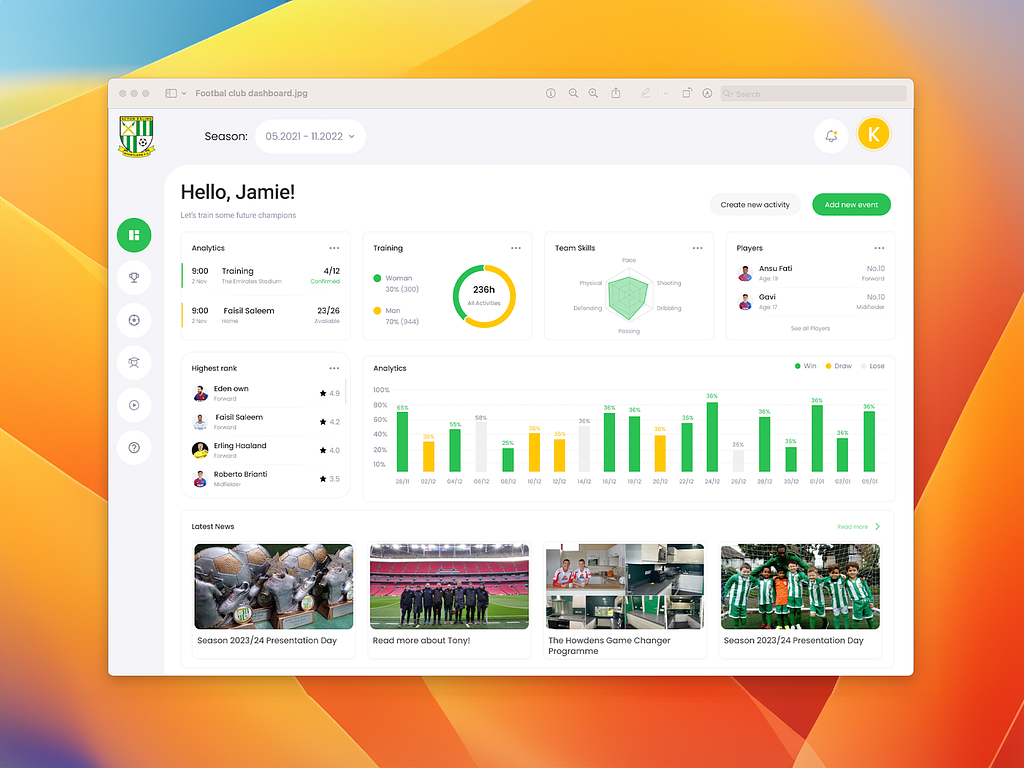
Role-Based Access Control (RBAC): The new dashboard allows Role-Based Access Control to the coaching and support staff. Based on their roles they can access data and take actions like “create new event(s)” or “create new activity”. For example everyone has their own timetable where they can access their activities or add new ones. Every user is welcomed with a personalised greeting, eg. “Hello Jamie”.
Data Visualisation: The main goal of every dashboard is this — Keep It Simple. To make the design absolutely user-centric, I used data visualisation (pie charts, bar graphs) to represent complex data.
Access to Wide Range of Data: Coaches, mentors and other support staff have access to a wide range of data from analytics, performance based rank list, team’s skills, their timetable etc. This helps them stay up to date on every little detail.
News Update: The news update section is also crucial as it shows upcoming events and avoids any form of double-booking or miscommunication. I added this feature after discussing it with Ben and the team.
The feedback after the usability testing session was overwhelmingly positive. I worked with Jamie, a mentor, who helped us by sharing his honest feedback. Upon his request I added a button to let them access data and analytics of a particular season. By switching the timeline using the “Season” button they can access data from the past.
The new dashboard has been very helpful to the Eastbridge United team. According to Ben, “The new dashboard has made operation smoother and has increased overall productivity by 30%”. The coaching and support team has informed that the new dashboard has helped save time, and has improved decision making. With access to a simplified version of a wide range of data the team can now easily retain complex information and take action accordingly. Delivering a product that users love is always fulfilling.
Want to hire a pro to design your dashboard? Let’s talk.
PREVIOUS PROJECT
EerieGG - Roblox gambling siteNEXT PROJECT
Restaurant Management System VOL 1