“The House always wins.”
That’s what wise, old men say about gambling. But what if you don’t play against the house? What if you didn’t play against some computer? Instead you got a real community of gambling enthusiasts!
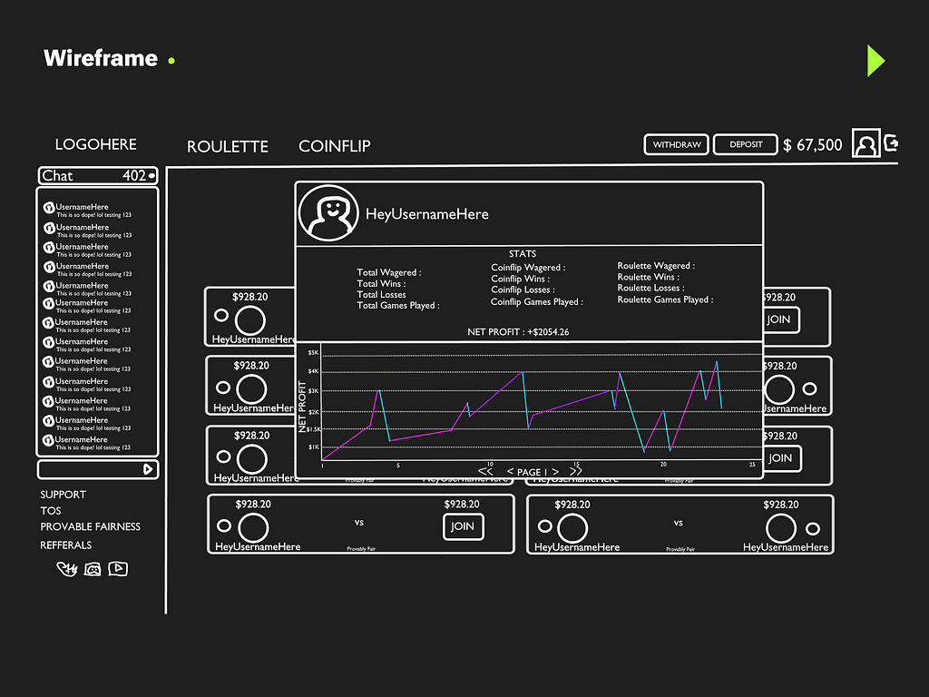
For EErieGG, the goal was to create an online community for gambling enjoyers where they’ll play Roulette and Coinflip with other community members. Their product management team had wireframes of their site ready with all their key features. What the company needed was an expert designer.
It is not every day that I get approached by a betting site. My original vision for this site was something like an e-gaming site with 3D visuals and characters and vibrant colours.
However, after discussing with Alex Demolis, the product manager, it was clear that EErieGG wanted to avoid the extravagant 3D interface and instead go for a sleek, minimalist design. Alex shared examples of competitor sites to provide a clearer picture of their goals.
Before diving into the website design, we had to come up with a logo. EErieGG wanted a mascot that would instantly identify their brand. For the visuals, Alex and his team wanted something spooky, dark and futuristic.
After some rough sketches I came up with this halloween style pumpkin face and settled on a complete logo with EerieGG brand name. The different shades of Black and Green adds character to the mascot, which instantly becomes a distinguished icon.
Logo designs take a while as the client wants to settle every detail as they should. For this logo, I provided 4 different versions so Alex and team can choose the face of their brand. After discussion they chose the one with the Neon Green border as it truly brings out the logo and brand name.
Once the logo was finalised we moved on to the website.
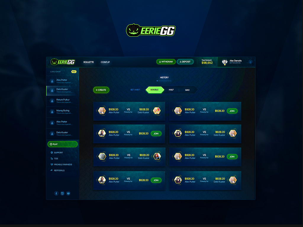
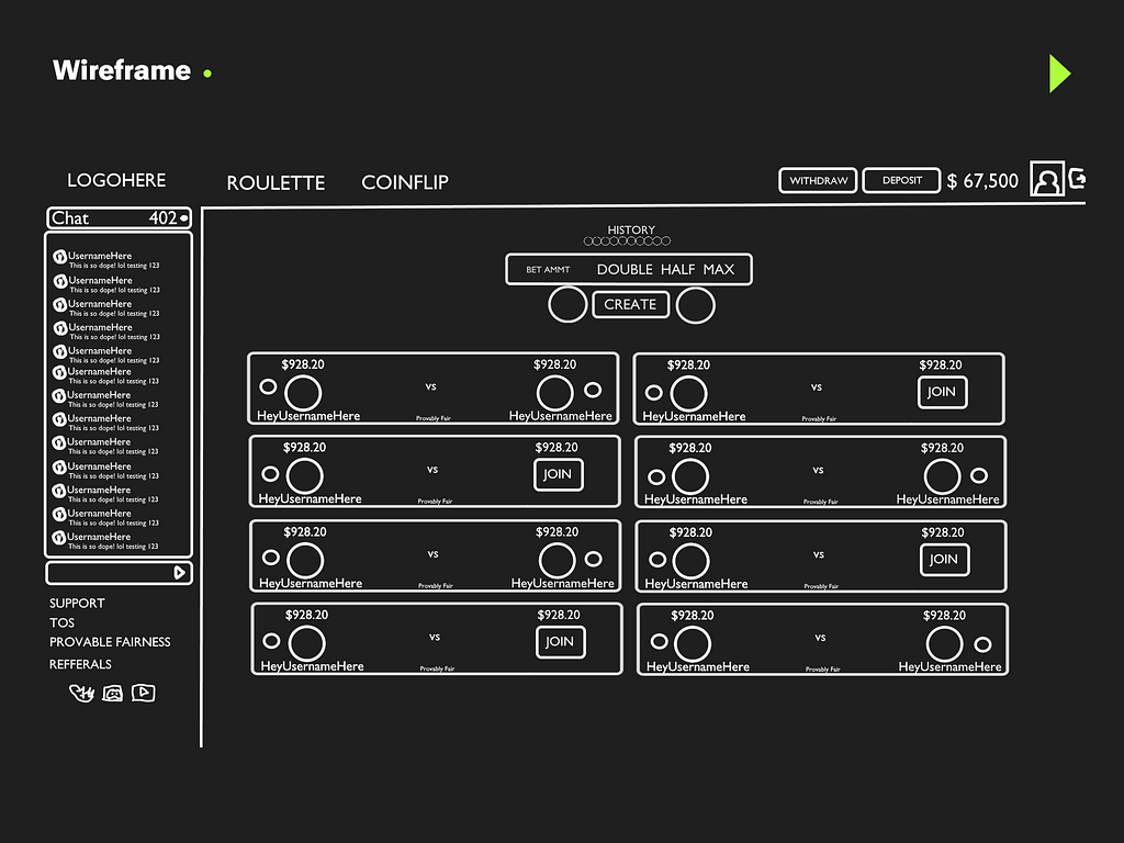
Alex showed me their wireframes and the key features that the website would have. New Gamblers would have the option to play Coin Flip bets against each other, join bets or create new customised bets. They would have the option to bet Double, Half or Max and access their history at any time.
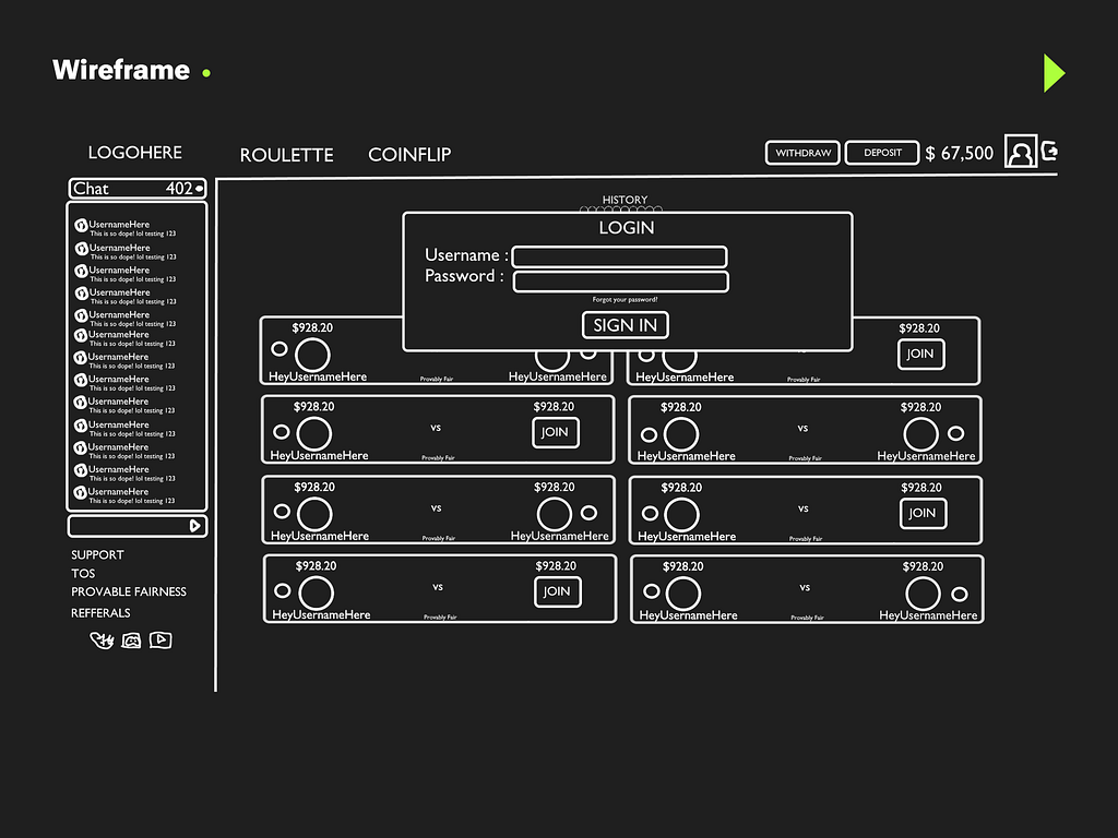
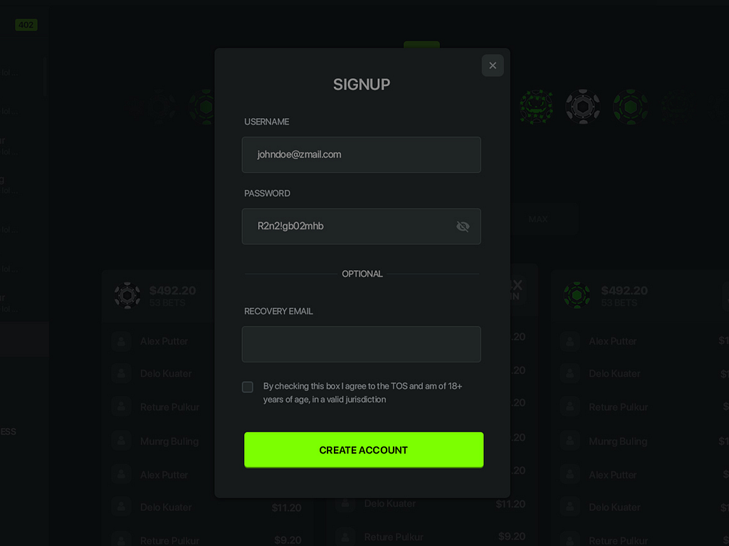
Easy Registration: Simple email and password login for a quick start.
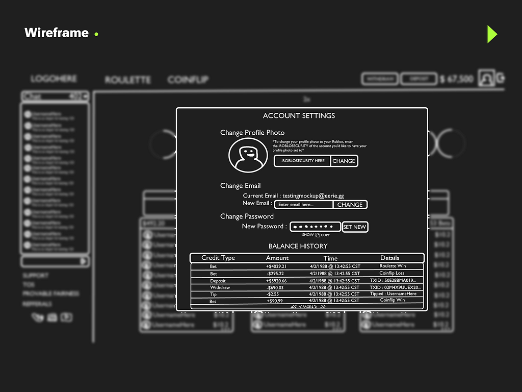
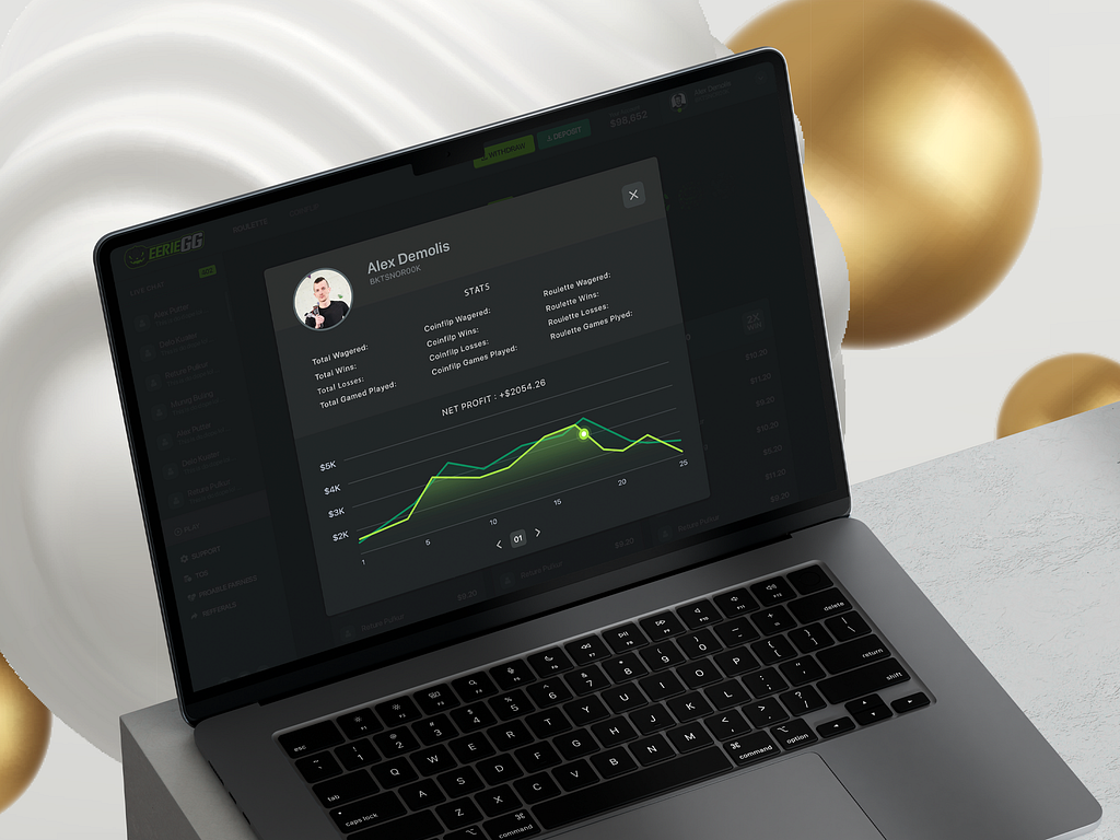
Account Settings: Detailed itemised list of all financial activities.
Data Visualization: Each profile includes a graph showing wins and losses to keep users informed and help them make better decisions.
Tools Used: Figma.
Challenges: Making the design engaging but not too flashy.
Solutions: Refining the design by gathering feedback and testing the UI to make sure it was user-friendly
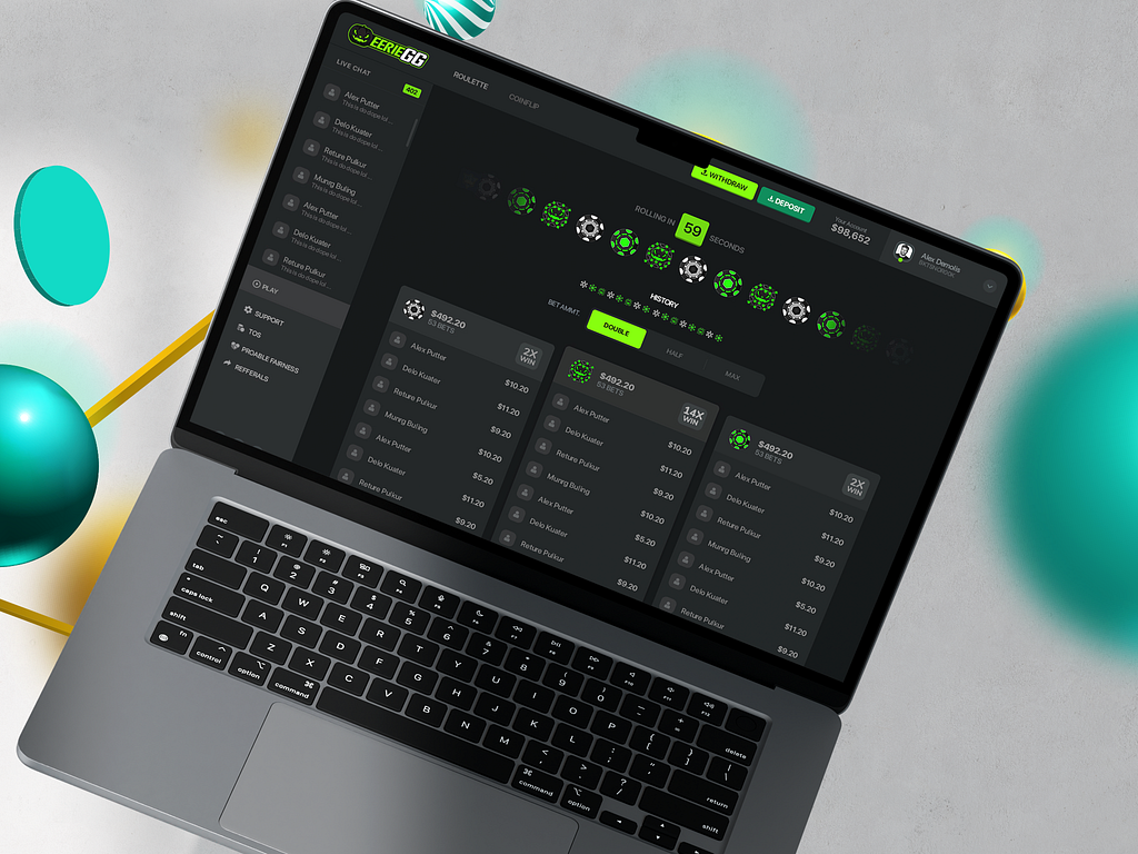
Since the EerieGG team wanted a minimalist style, I used their brand colours black, green and white to create a futuristic, gaming look with a touch of sophistication. The dark theme background creates the perfect background.
Different shades of green are used as accent colours to highlight important features like betting options and the withdrawal and deposit buttons. Three different types of poker chips symbolise three different betting options and bring the casino environment to the screen.
The Sign-up page is intentionally made to look familiar and minimal. The green CTA button catches the user's attention instantly. This increases efficiency and reduces friction.
The Neon green shades most come handy with the data visualisation aspects, making graphs easy to understand. Two different lines of green show different performances across two betting games.
The feedback session was crucial. Similar to the logo design phase, Alex and I had productive dialogues about the website design. One major pain point was the need for clear icons along with labels for the “Deposit” and “Withdraw" buttons so that players were always well-informed. I added relevant icons and adjusted the shades of green to avoid any confusion.
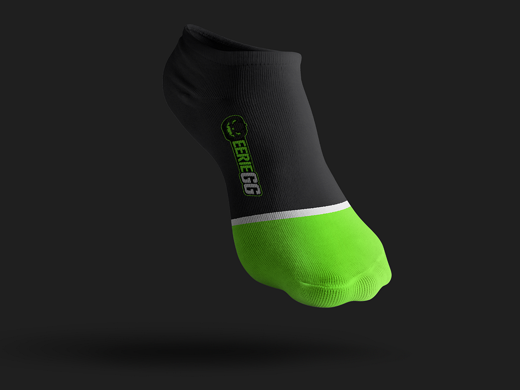
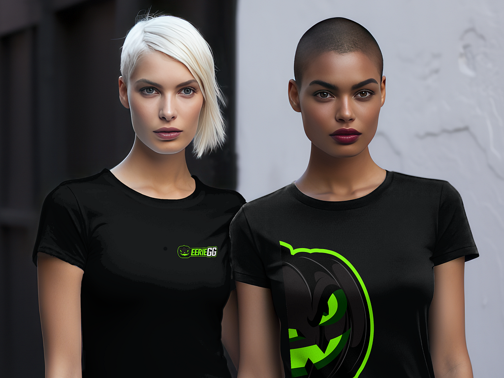
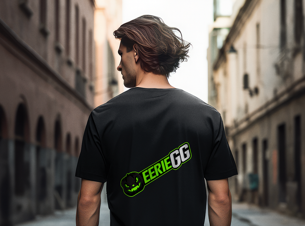
Originally, this project was supposed to end with the website design. However, the EErieGG team wanted to create merchandise with the new logo.
I designed t-shirts, socks, and back-print t-shirts to show how the logo would look on their products. The black and green logo gelled well with black t-shirts.
Cool, well-designed merchandise are essential for brands that aspire to build communities with their users.This merchandise line would help the client create a strong brand presence online and offline.
It’s always a special occasion when a client comes back with more projects and when it happens within one project it’s truly a great sign. This goes to show that expert design and great customer service can take a business a long way. As a freelance designer I don’t have the facilities of a design studio; what I can offer is better, world-class design, communication and a record of client satisfaction.
Want to hire a professional UI/UX designer? Let’s chat.
PREVIOUS PROJECT
Cathay Cargo Shipment Management DashboardNEXT PROJECT
Football Club dashboard design