Keeping up with the latest trend is CRUCIAL for every designer. Whenever a new feature, new model drops we rush to see how to level up our game.
Let me be honest— as a hardcore Apple fan, I especially wait for new apple products. My own design has always been influenced by their design. Inspired by their sleek, clean design style I have created my own.
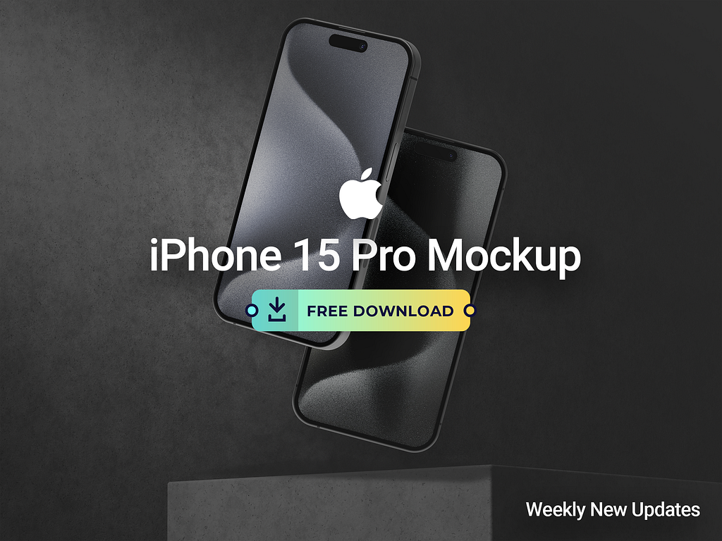
When the iPhone 15 Pro launched in the UK I rushed for an upgrade. After the initial excitement of unboxing a new iPhone, I looked closely at each new element. I loved the customisable action button. It makes the device more dynamic by providing the option for personalisation.

I knew with this new product in the market, many designers and developers would look for an accurate mockup to keep them up-to-date. I was one of them. That’s why I researched this new mockup but as a fan I wanted to design my own mockup. This project thus started as a recreation, a project that was just for me and I enjoyed the process thoroughly.
Apart from this, an accurate mockup is a very helpful tool. It helps us represent our work to clients and show them how their app/website may look on a particular device.
Working with the latest mockups also helps us demonstrate our skills and makes us prepared to adapt apps to the latest technology and user expectation.

The first step for designing a mock up is getting accurate information about the design. Even if users can’t tell, I can tell if my mockup doesn’t match the product. So, accurate information is crucial if the mockup is to be useful later.
The designing part also hinges upon accuracy and observation. I used Figma as it helps me achieve the perfect detailings of all my designs.
I paid particular attention to make sure the spacing, colour schemes, typography everything was consistent. Attention to detail is must when designing mockups.
The mockup also reflects how users interact with the interface. This helps the designer consider the touchpoints and accessibility while creating his own designs.
Also, I tested the product myself and made changes to create something useful and satisfactory for all.

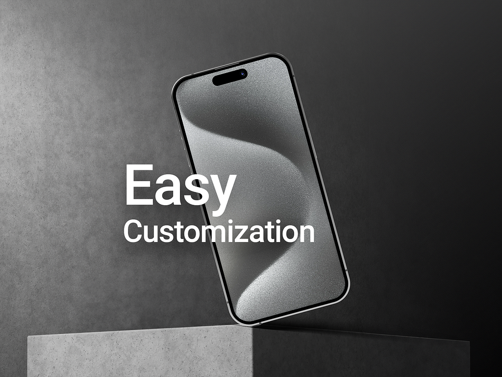
For designers like me the customisable layers, help us incorporate new features and design details to our work. Moreover, it really helps make the design responsive to the new iPhone 15 Pro model.
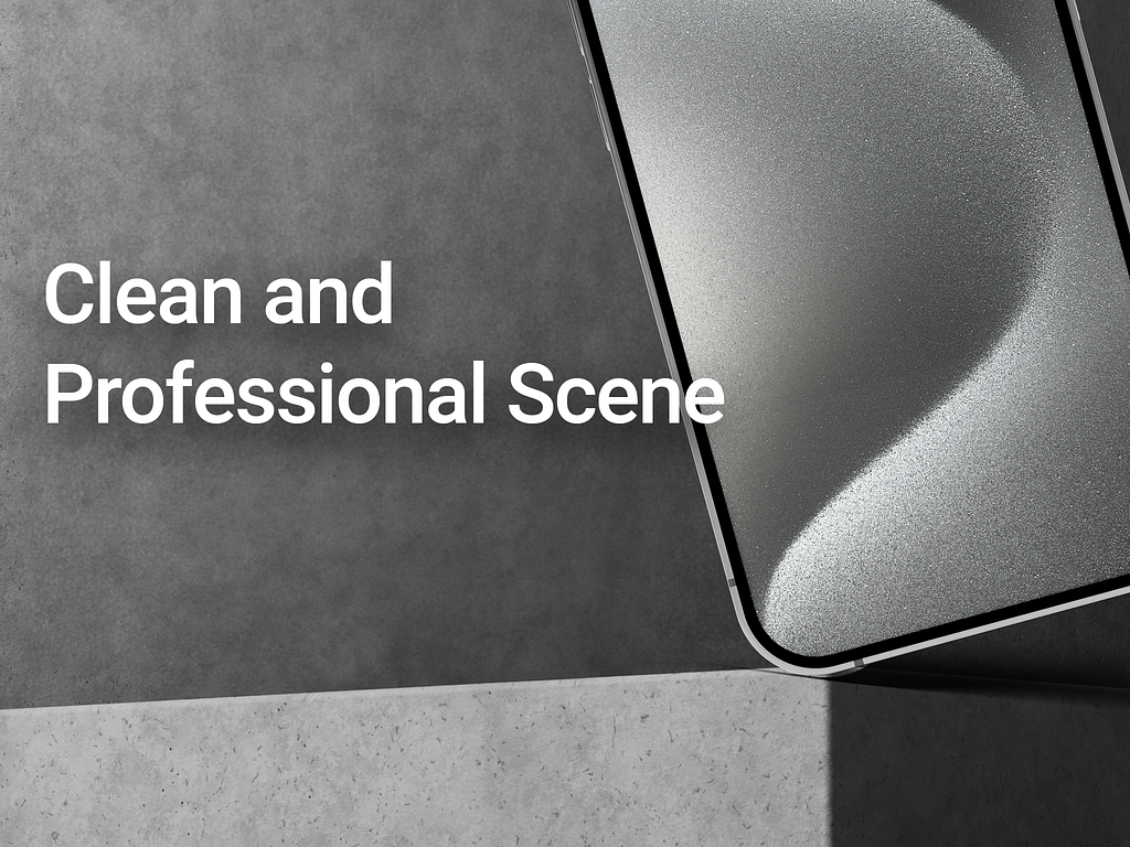
The clean and professional look of the iPhone has been captured with minimalist style and use of neutral colours. I use it to show my clients how their app may look on an iPhone 15 Pro.
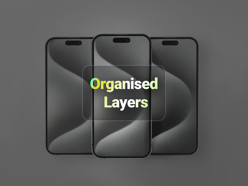
One of the final things that I wanted in this mockup was to keep the layers neatly organised. This helps locate the specific elements during customisation and makes the entire process smoother and faster.
Designers become better by staying relevant and continuously polishing their skills. Throughout this journey we use and share valuable resources like UI kits, mockups, colour palettes, typekits etc to grow and improve together.
This is why, after testing and using the mockup for my own projects, I have decided to share it with the entire design community. I waited till I tested the product and was satisfied with its standards.
This free mockup is for all my fellow designers,especially the apple fans. Happy designing!
PREVIOUS PROJECT
Fitness Mobile App UI design styleNEXT PROJECT
Vivino - Wine Ecommerce app