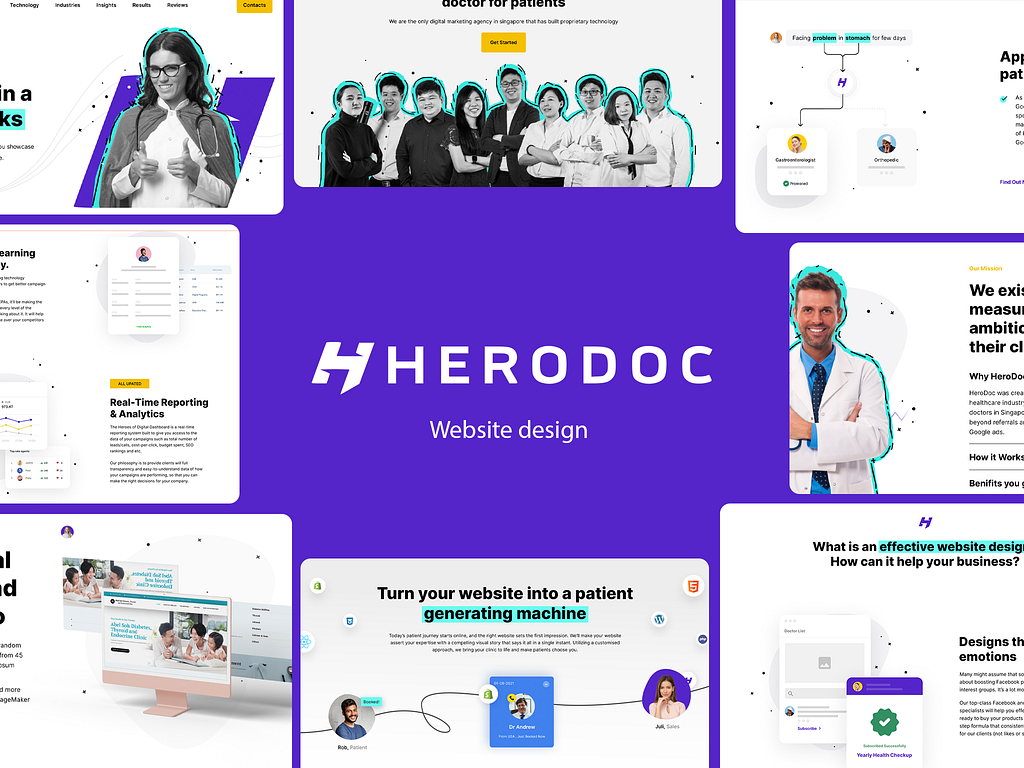
Herodoc is a trusted company in the healthcare industry that helps clinics bring in more customers by helping them get noticed online. Helping their clients with digital marketing Herodoc understands the importance of a well-designed website. For their website, they wanted a modern, user-friendly, engaging website. Their team reached out to me through a complimentary consultation.
After my initial research, I prepared a few mockups for the client and let them choose the course of the design.

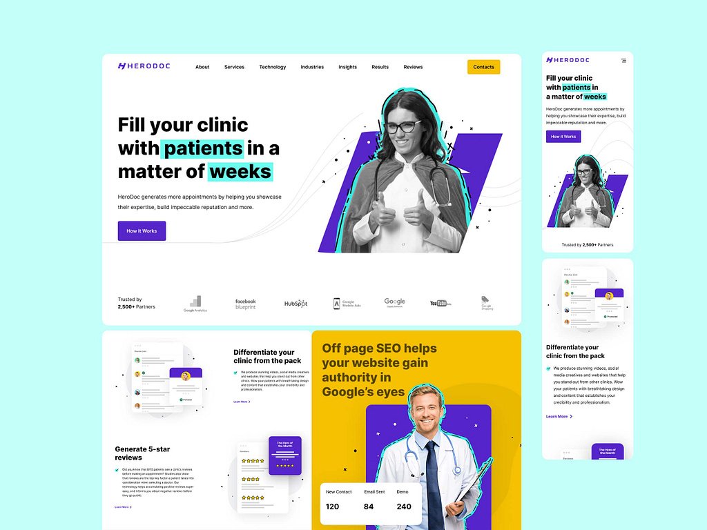
I opted for a minimalist, organized layout for this project, strategically highlighting essential information and visual elements. The Hero section creates a strong impression with a black and white picture that pops out because of the creative use of color. This same method is used to highlight the keywords in the headline.
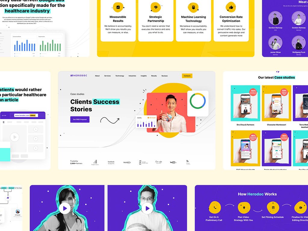
Every section uses this strategy to offer relevant information to the users, like their case studies, client testimonials, and professional journeys broken down in numbers.
Every important section comes with concise and highlighted call to action buttons that guide the users through their desired course.

This project was a success as it not only exceeded the client’s expectation but also created a platform that was designed for their users. The clear and concise call to action buttons, organised layouts and easy to navigate design — all of these together provide an engaging web experience for their users. The design is also responsive to various screen sizes making it easy to access for all.
If you need the perfect website that delivers the best user experience while maintaining your brand image, feel free to contact me.
PREVIOUS PROJECT
Trinity Holiness Church