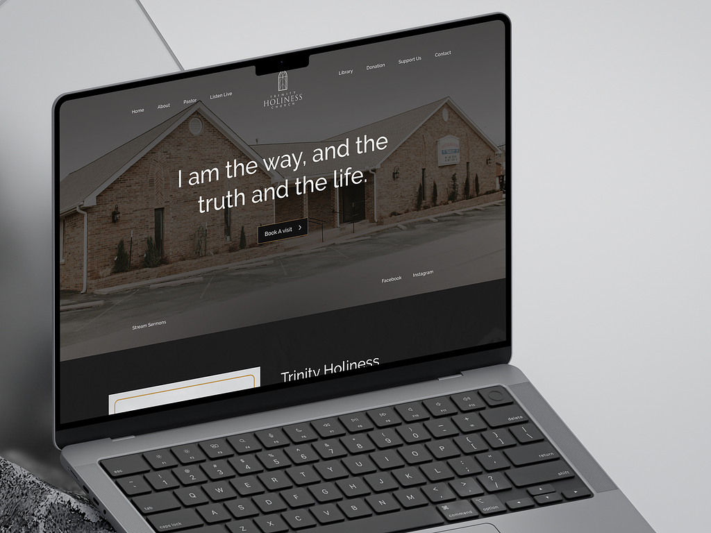
Trinity Holiness Church is a church community. They needed a website for their church to easily reach the community that too under a reasonable price. After looking for an experienced UI/UX designer for quite some time they booked a free one-to-one consultation with me. During this discussion, we discussed the unique requirements of this project and how it could be done under their budget.
In this project connection was the main theme. The website by design needs to connect the users to Trinity Holiness Church. I designed a few mockups that brought forth the message of the church and let the client pick one that best suited their vision. The design structure was created to guide the users easily through the website.
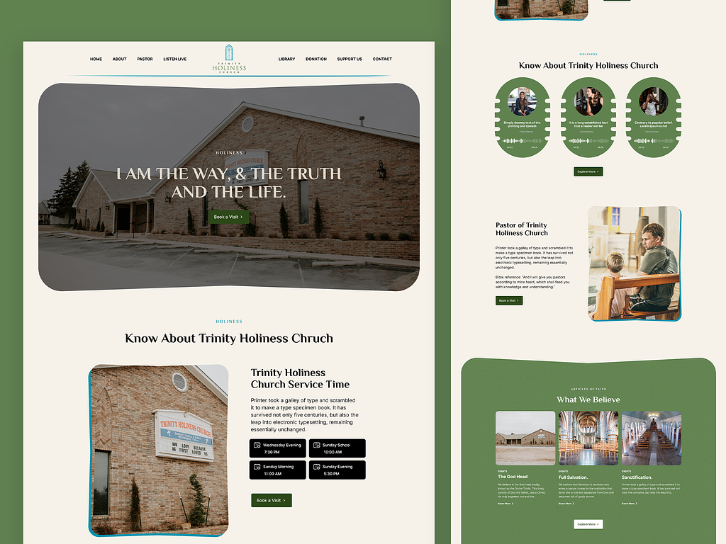
“I am the way, and the truth, and the life” — this Bible verse is the central element of the hero section. There’s a clear call to action button that let’s users book a visit with ease. The colour palette and typography creates an inviting and serene atmosphere. The intuitive design guides users to easily scroll through the website. Responsive design elements make it accessible to all users.
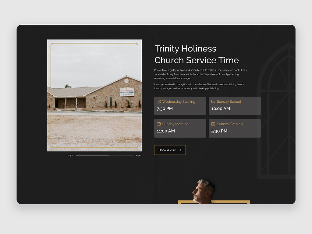
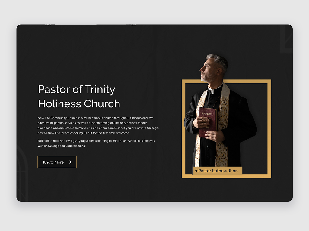
The Church is open to both members and non-members. This is reflected in the website as well. There’s an introductory section that introduces Trinity Holiness Church to new visitors.
There’s also a dedicated section informing all the specific dates and timings of the subsequent church services. It allows the church to directly inform members of the date and time of Church services. The clean interface guides the users’ eyes and the clear labelling of each section avoids any confusion.
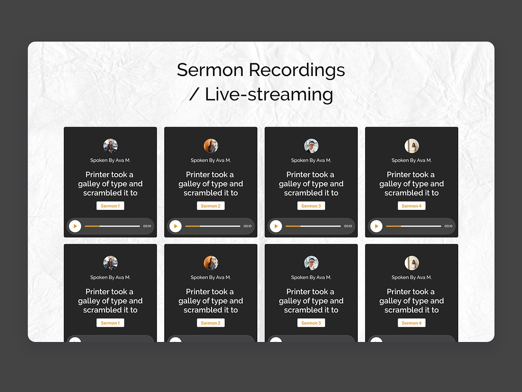
This section offers a glimpse of the amazing resources the church offers. There are live recordings of sermons arranged in a neat organised layout.
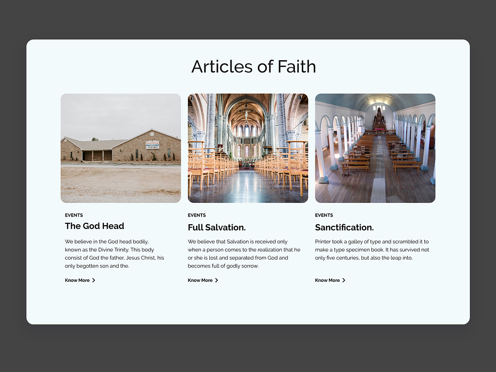
The “Articles of Faith” section was designed to spread the important teachings, concepts of the Christian faith. It represents a culture of growth and learning, allowing new members to feel at ease during the beginning of their spiritual journey.
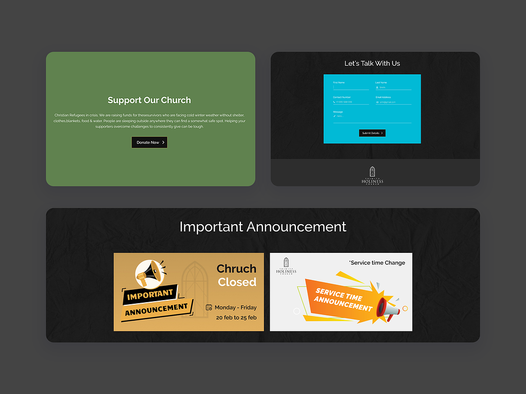
As mentioned earlier, connection, communication and humanity are at the center of this project. That’s why the website has separate sections with clear calls to action that let the users engage with not just the website but also the operations of the church. They can donate and offer their suggestions. There’s also an eye catching banner informing members of any changes in time, cancellation, or postponement of church services.
This project was more than just a job. It focused on human connections and community. I designed a website that matched Trinity Holiness Church and fit into their budget. The goal was to design something functional, beautiful and easy to use.
If you need the perfect website that delivers the best user experience while maintaining your brand image, feel free to contact me.
PREVIOUS PROJECT
Bonus Life StudioNEXT PROJECT
Herodoc Case Study