You can ask any professional designer about their opinion on UI kits and you’ll hear an unanimous answer of how UI kits help us improve our design. Searching and finding the perfect UI is crucial because that can help us accelerate our entire process.
A year or two ago, I was on a similar quest, trying to find an updated, modern ecommerce app UI Kit that would help me design apps, stay consistent and finish projects faster. There were plenty of UI kits available online and only a few that were usable. If I liked something for their consistency then there were issues with labelling and organising. The majority of UI kits that I reviewed were outdated. So I was desperately searching for that one kit that would be useful to me in the long run.
After a few days of searching I realised that I couldn’t waste my time on this anymore. So I decided, “Whatever, I’ll make my own.”
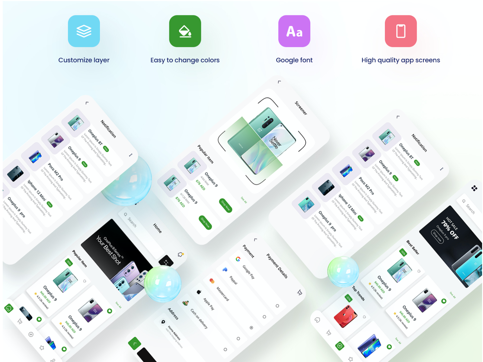
According to me, every good UI kit must be easy to customise and should obviously be of good quality. Otherwise, what’s the point?

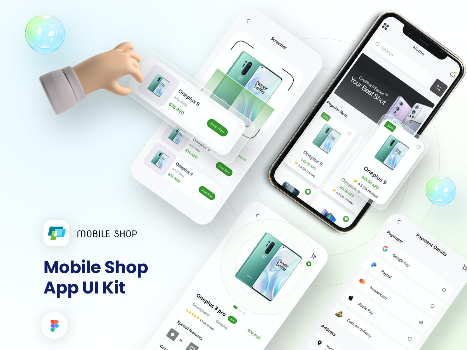
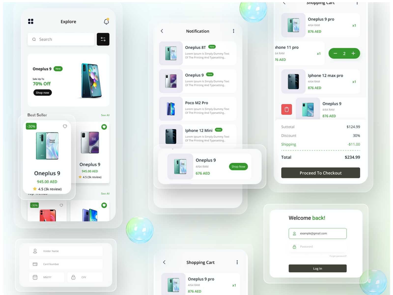
Well, this kit has high-quality app screens that I can easily customise to make it match the branding. I created a standard mobile shop app UI that has all the essentials like the sign-in page, notification page, shopping cart page, payment page, etc. These all have a standard design that can be used in multiple projects with minimum changes.
The home page also maintains a clear visual hierarchy that makes the design user-friendly and brand friendly. One of my inspirations for this was the Marks & Spencer mobile app. That’s why the homepage begins with a search bar and a banner to advertise new products or offers.
Following the banner page, I have made categories like “Top Trends" , “Best Seller" and “Popular Items”. These are all easily customisable based on the requirements of the project, the client or particular marketing strategies.
The best part of using a UI kit is maintaining consistency so that the design looks coherent. Additionally, this UI kit is made after researching the ongoing trends, years of proven methods and some of the best e-commerce apps in the market (including M&S, Amazon, Etsy, etc).
From notifications to payments, every page has a familiar look, with well-known icons, badges, and organised layouts. I kept everything simple so the app looks neat and any additional elements like shadow and depth can be added later as per the aesthetic requirement of each project.
I added a “Screener page” as well, which compares the selling price of the same product with different features and prices. This can be used to compare similar products sold by different retailers as well for different e-commerce design projects.

I’ll say it has worked great for me. Honestly, the tough part was figuring out the plan for the UI kit. But once the design was done, I could fast track all my e-commerce app design projects.
Before using it, I conducted user testing with an interactive prototype that really helped me tune it to perfection. The screener feature is my personal favourite. Based on the feedback of our user team (a few friends and colleagues), I added the badges to distinguish new products and exciting offers. This change, along with a few other detailings, significantly improved my kit.
This UI kit has helped me design apps that are organised and user-friendly yet clean and responsive. I know a few designers who also benefited from this and reached out to discuss the design or their projects.
If you ask me, what’s easier, making or finding a UI kit? My preference is searching because I rarely find the time to design a UI kit while working on client projects. However, I somehow managed some time of my own and designed this. This was an investment to improve my own work and deliver designs faster. Honestly? It has paid off.
Want to discuss your e-commerce app’s design with an expert? Let’s talk.
PREVIOUS PROJECT
Hotel Booking AppNEXT PROJECT
Fitness Mobile App UI design style