So, I built this hotel booking app for a client. The final look even left me impressed. Which is why I didn’t want to waste this valuable resource.
The project started when I was approached by a startup to design their new hotel booking app. The owners wanted a design that would incorporate everything from cosy boutique to luxury resorts. A clear, organised, clean design that would guide users to their perfect accommodation. Every hotel needed to be showcased with all its perks to make it an exciting and unmissable deal.
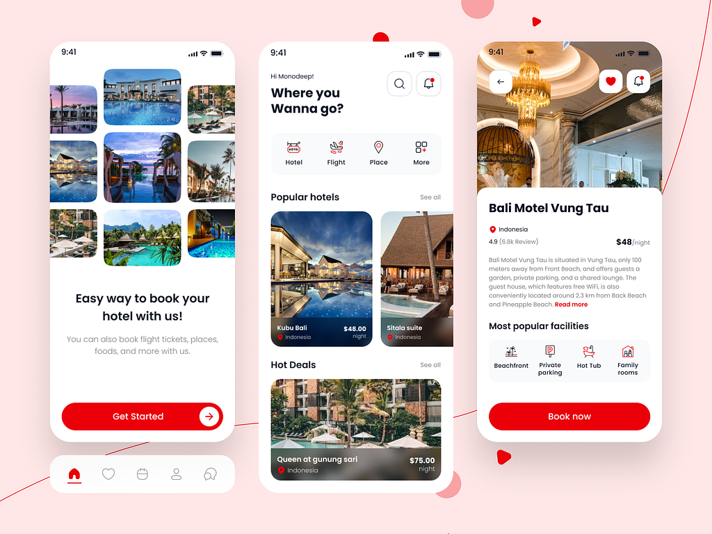
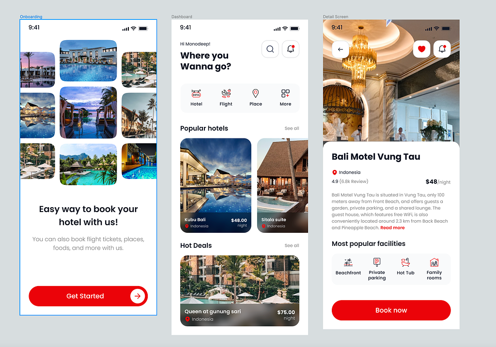
When I was designing the concept, my first priority was visual hierarchy and a proper layout where every traveller would find their housing solution. Every hotel shown had to be attractive enough to not just draw attention but also meet the user’s demands. From the onboarding page to the details page, attractive visuals, intuitive design, helpful icons and strategically placed CTA buttons would make the app navigation smooth and fast.
The best part of this design, which I later realised was this could be the perfect app for many others as well.
Let’s find out!
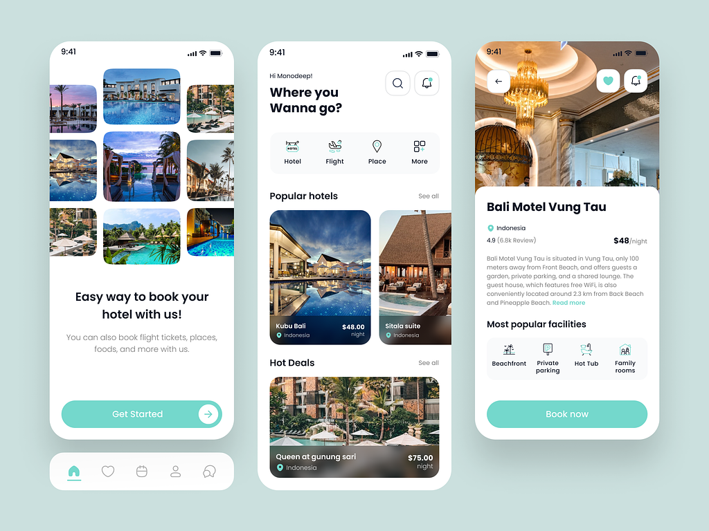
I started off with a plain and simple background and solid colour palette. This app comes in 3 different themes : red, neon blue and yellow. These theme colours are used as accent colours to highlight important sections and CTA buttons. This creates a versatile base that can be easily adapted to match various branding guidelines.
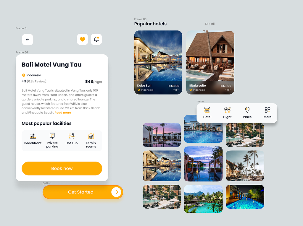
There's a clear hierarchy of information,with prominent headings and clear calls-to-action (CTAs). This structure can be maintained while tailoring content for different clients. The Popular Hotels and Hot Deals create specific sections for users to search hotels based on their priority. These headings can be changed based on the client’s marketing strategy.
The icons used in this design solely focus on user-friendliness. Every icon represents a service or facility so it’s important that users can easily tell what they are for. Additionally all of them are labelled to avoid any further mistake. All of these icons come in the three themes.
In the onboarding page there’s a collage of exotic locations that create the perfect moodboard to evoke wanderlust. For the hotel description page too the emphasis is on visuals which is accompanied by a brief description (with location, review and price) and set of icons representing the perks.All of these can be updated and edited based on seasons, specific locations or for specific moods. Any brand can edit it using the Figma source file to match their vision.
Though the client’s app finally did not launch due to funding issues, which sometimes happens unfortunately. But I had put in a lot of thought and hard work into designing this so I chose to keep it. I thought this may help my portfolio. If you want to commission me to design a hotel booking app or any app in general this will give you a pretty good idea of the work I do.
The modular structure, clear hierarchy, responsive layout are some of the features that make the design set itself apart from the rest. The user-centric, visual based style makes it perfect for hotel booking and travel apps.
Do you have a hotel booking app design project? Let’s talk.
PREVIOUS PROJECT
Delivery app designNEXT PROJECT
Mobile Shop - Premium Ecommerce App UI Kit