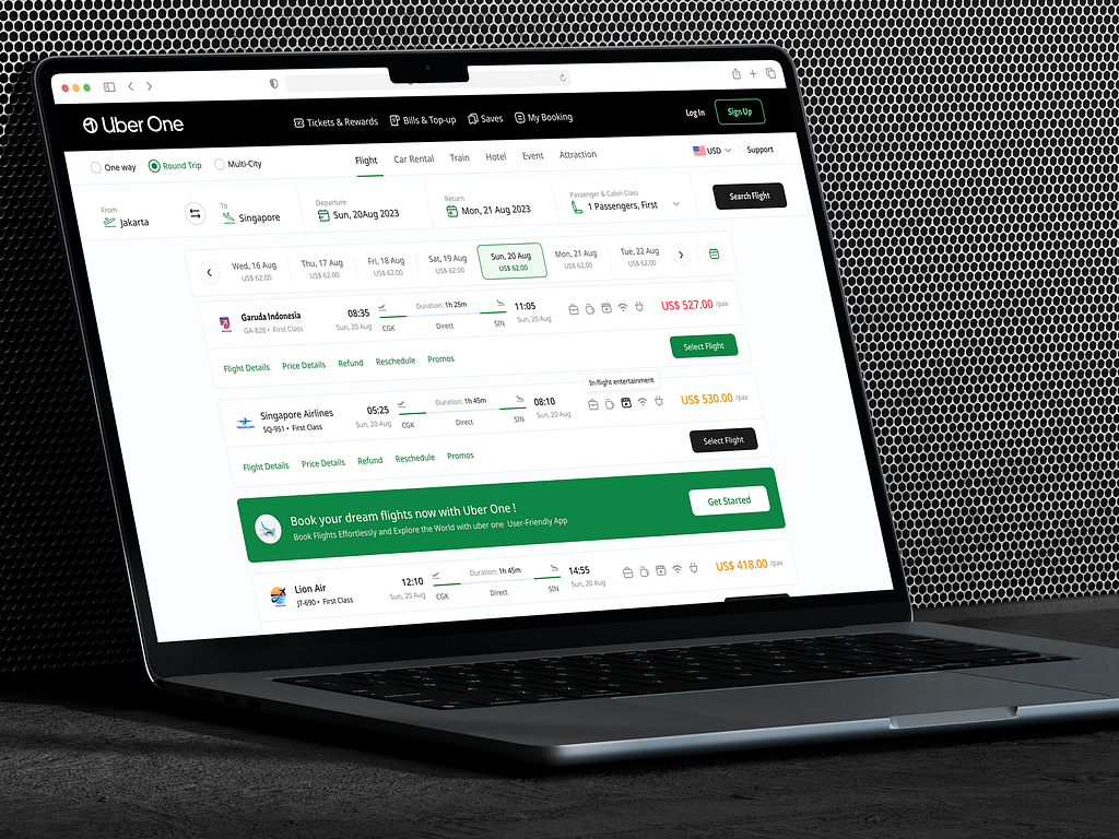
I designed Uber One’s flight booking app. As a frequent flyer, I have used many flight-booking apps over the years. I knew where the app could improve. I used my user experience and my expertise for this design project to create something users like me will enjoy. This was a very rare opportunity, and I took a few chances.
I focused on the points that I, as a user and a designer, would want to see improved.
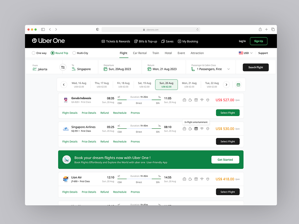

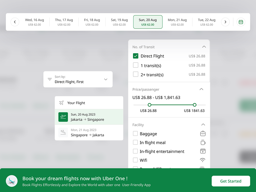
The visual design was kept clean and minimalist, aligning with Uber One’s brand.
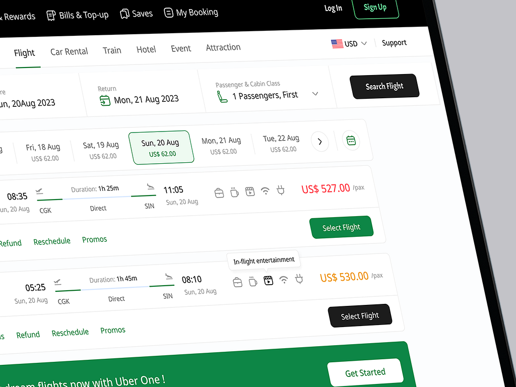
The final design significantly improved the user experience. It featured a user-friendly interface that made booking flights simpler and more accessible.
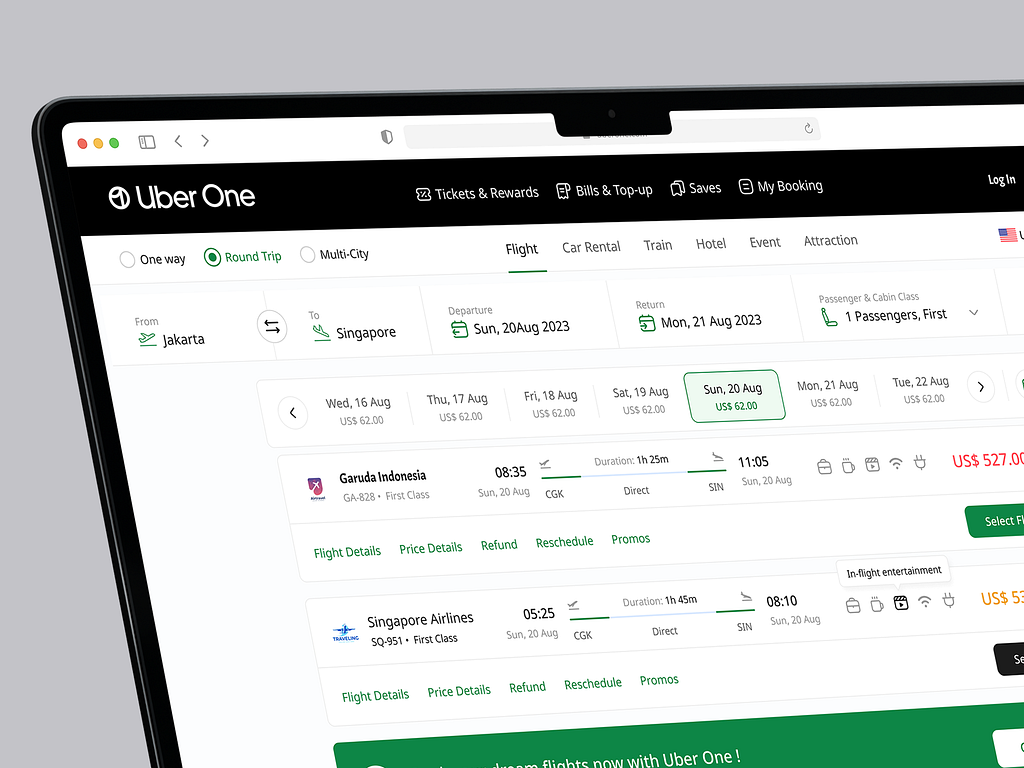
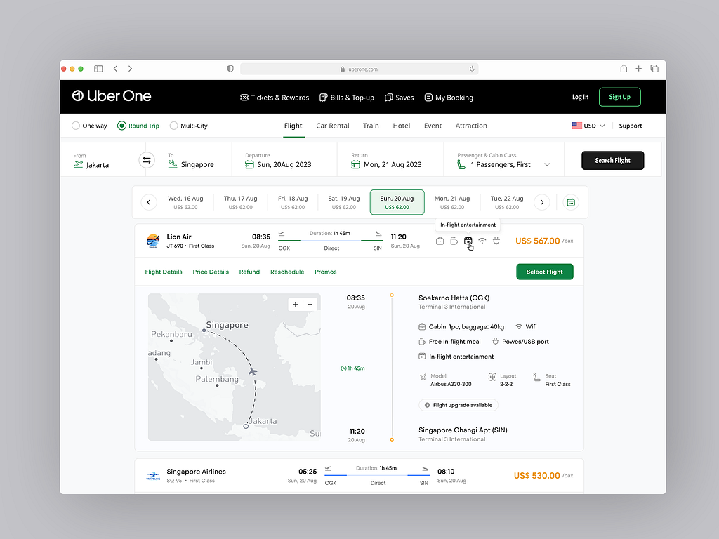
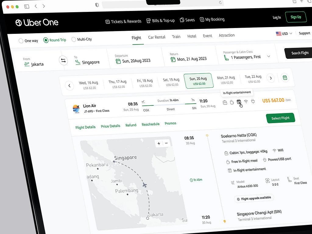
The Uber One flight booking web app successfully met the project objectives. The clean, intuitive design enhanced the user experience, leading to increased engagement and higher booking conversion rates. This project demonstrated our ability to combine research, user-centric design, and aesthetic appeal to deliver a high-quality product that exceeds expectations.
If you need the perfect website that delivers the best user experience while maintaining your brand image, feel free to contact me.
PREVIOUS PROJECT
Definite Marketing - website case studyNEXT PROJECT
Invoice Page Design Case Study