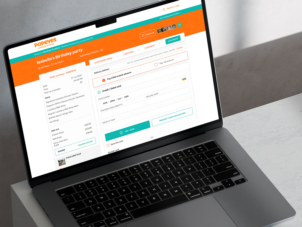
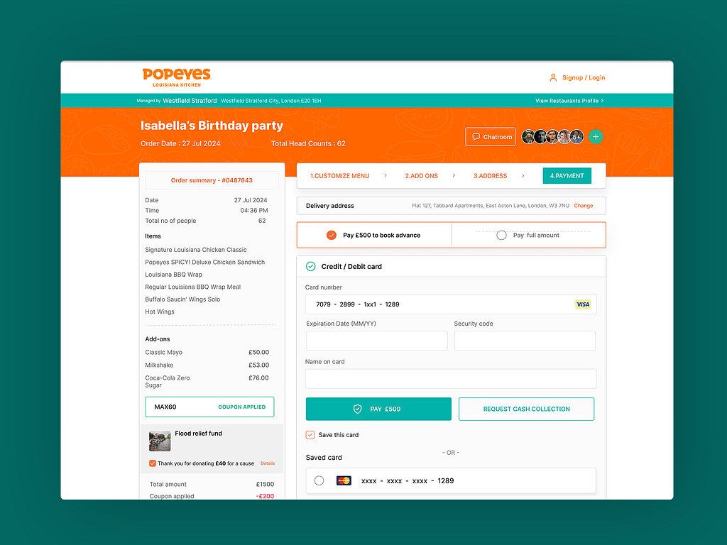
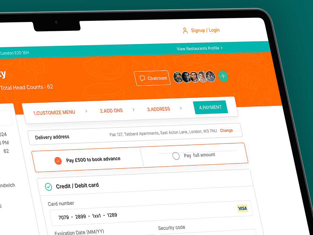
Popeyes is a well-known fast-food chain around the world. I recently worked on their UK website’s invoice page. The goal of this project was to create an intuitive, user-friendly interface that improves the overall customer experience during the checkout process.
The primary aims for this project were:
Usability: Design an interface that’s easy to navigate and understand.
Visual Appeal: Create a visually appealing design that goes well with Popeyess' branding.
Increase Conversion Rates: Design elements that facilitate smooth user flow and reduce friction points in the checkout process.
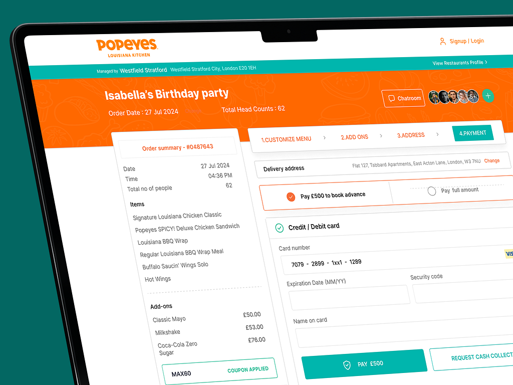
Color Scheme: Popeyess' signature orange and green colors are used to draw attention and guide users.
Clear Hierarchy: Headings, subheadings, and section dividers create a clear progression through the process.
Readability: clean font, ample spacing, and highlighted key information enhance readability.
Call to Action (CTAs): Prominent CTAs guide users through the checkout process.
Visual Feedback: Messages and acknowledgments keep users informed of their actions.
User-Friendly Forms: A clean layout and clearly labeled fields reduce errors.
Progress Indicators: The step-by-step progress bar shows users where they are in the process.
The Popeyes invoice page is designed to be easy to use, visually appealing, and true to the brand. It uses clear headings, prominent buttons, and a responsive design to make the user experience smooth and engaging. This design aims to increase user satisfaction and online ordering success.
If you need the perfect website that delivers the best user experience while maintaining your brand image, feel free to contact me.
PREVIOUS PROJECT
Uber One - Flight Booking Web ApplicationNEXT PROJECT
Avere Tax Planning Website Homepage Redesign