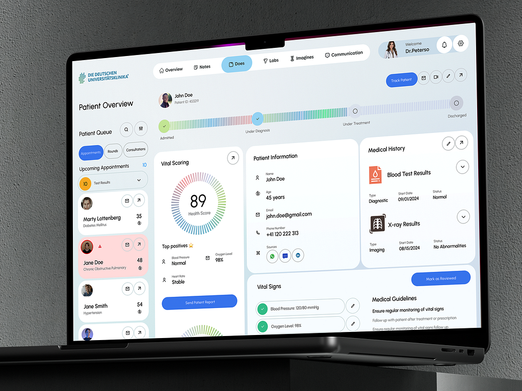
The analysis will focus on how each feature enhances user-friendliness for doctors, promoting efficiency in patient management and care
Components:
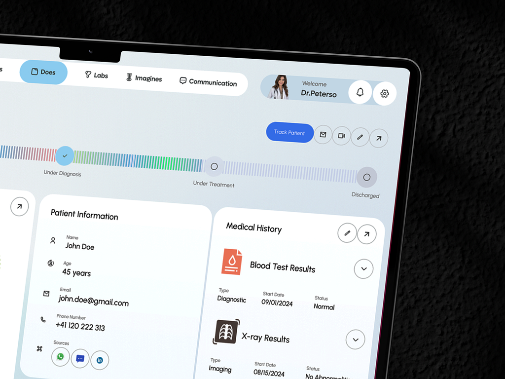
Hospital/Clinic Logo
Tabs for Overview, Notes, Labs, Images, Communication
Doctor's Profile
Explanation: The header is designed for quick access to the most critical tools a doctor needs. The tabs allow the doctor to navigate effortlessly between sections like patient notes, lab results, and medical images. The consistent placement of the doctor’s profile and hospital logo reassures the user of their working environment while making it easy to personalize and manage their settings.
User-Friendly Aspect:
Easy Navigation: The tabs at the top make it simple for a doctor to switch between different views without feeling overwhelmed by too many details at once.
Personalized: Doctors see their profile, which helps identify who is logged in, ensuring personal accountability for decisions and patient care.
Components:
Patient Name & ID
Patient Progress Bar (Admitted → Under Diagnosis → Under Treatment → Discharged)
Action Buttons: Track Patient, Email, Video Call, Edit, Share
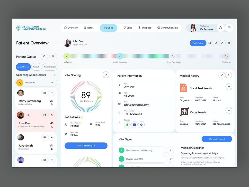
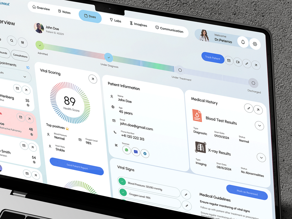
Explanation: This section provides an at-a-glance status of the patient’s medical journey. The progress bar is especially intuitive for doctors, as it visually indicates where a patient is in their treatment process, from admission to discharge. Action buttons such as Track Patient and Video Call are prominently placed, allowing doctors to take immediate action when necessary.
User-Friendly Aspect:
Visual Cues: The progress bar quickly communicates the patient’s status, helping the doctor focus on the most critical tasks for that patient.
Immediate Actions: With buttons like Track Patient and Video Call right at the top, doctors can quickly initiate communication or further track progress without hunting for options.
Components:
Health Score
Top Positives (Blood Pressure, Oxygen Level, Heart Rate)
"Send Patient Report" Button
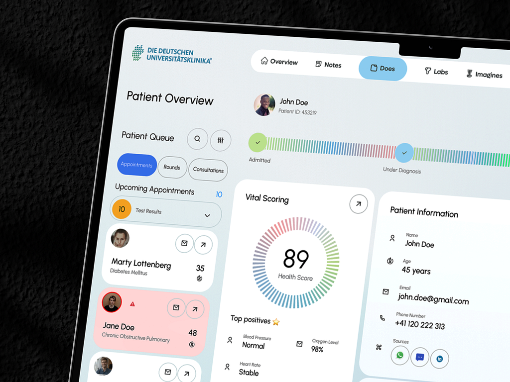
Explanation: This section offers an overall Health Score based on real-time vitals, providing a concise summary of the patient’s health at a glance. The Top Positives feature highlights critical metrics like blood pressure and oxygen levels, which immediately inform doctors if any of these essential parameters are out of the normal range. A Send Patient Report button makes it simple to share patient details with other healthcare professionals or the patient.
User-Friendly Aspect:
Real-Time Overview: The health score is a quick way to assess a patient’s overall status, reducing the need to manually review each metric.
Actionable Insights: Having the ability to send reports directly from the dashboard streamlines communication, improving workflow efficiency.
Components:
Patient’s Name, Age, Email, Phone Number
Icons for Additional Sources of Contact (Messaging, Video Call, etc.)
Explanation: This section provides essential patient contact information in a clean and accessible format. Doctors can immediately identify who the patient is, their age, and how to contact them (email or phone). If more advanced communication is required, there are icons for video calling and instant messaging built right in.
User-Friendly Aspect:
Quick Communication: By integrating contact icons (email, call, chat) directly within the patient details, doctors can immediately connect with patients or caregivers if necessary.
Simple Layout: All relevant details are consolidated in one area, reducing the time a doctor spends searching for basic information.
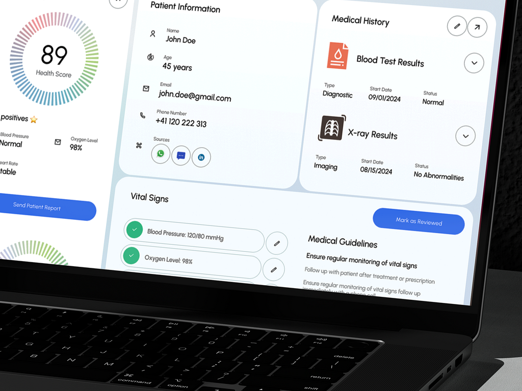
Components:
Blood Test Results
X-ray Results
Types, Dates, and Statuses of Tests
Explanation: This panel focuses on a patient’s medical history, including blood tests and imaging results. Each entry is displayed with essential information like test type, date, and the status (e.g., normal, no abnormalities). Doctors can quickly expand each result for more detailed insights if required.
User-Friendly Aspect:
Condensed Information: Doctors don’t have to sift through long medical reports to see results—they get an instant snapshot of critical diagnostics.
Expandable Details: For more in-depth review, each section is collapsible, allowing for both quick glances and deep dives into medical history without cluttering the interface.
Components:
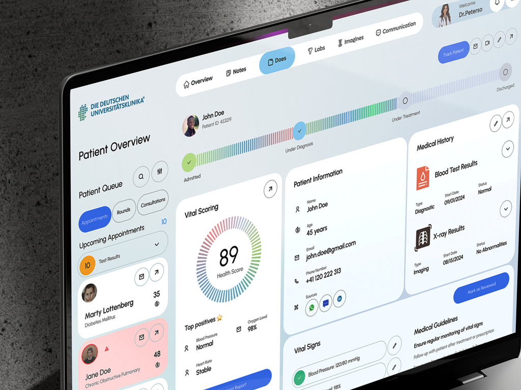
Appointment Queue with patient names, diseases, and status indicators
Quick Filters: Appointments, Rounds, Consultations
List of Upcoming Appointments and Patient Test Results
Explanation: The sidebar organizes patient appointments, rounds, and consultations in a highly accessible format. Each patient is clearly labeled with their condition (e.g., Diabetes Mellitus, Chronic Obstructive Pulmonary), making it easier for doctors to prioritize cases. Red warning indicators on certain patients (like Jane Doe) quickly notify the doctor if there’s a critical issue that requires immediate attention.
User-Friendly Aspect:
Clear Prioritization: The use of visual cues like colored warning icons helps doctors quickly spot urgent cases.
Quick Filtering: The ability to toggle between Appointments, Rounds, and Consultations ensures that doctors can organize their time based on their immediate responsibilities.
PREVIOUS PROJECT
Agency Dashboard DesignNEXT PROJECT
Cathay Cargo Shipment Management Dashboard