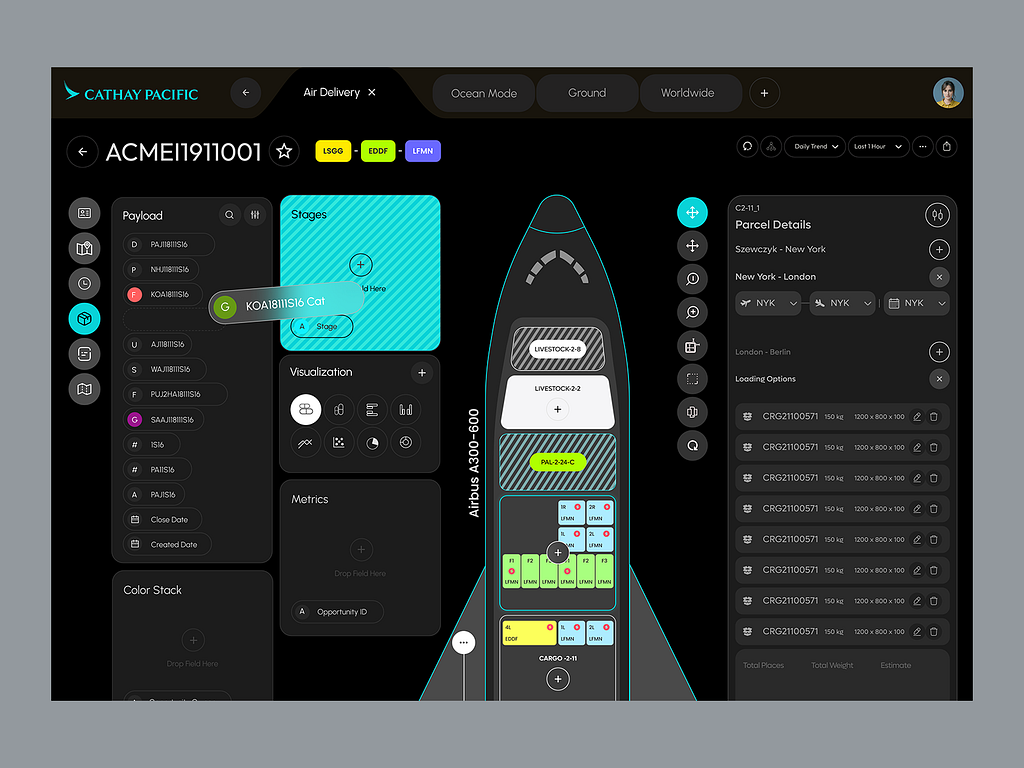
An outside perspective often does wonders for creative projects. When Cathay Pacific’s in-house UI/UX team approached me I jumped at the chance to help solve their problem. To make their cargo shipment operations more efficient, their dashboard needed to be completely revamped and updated.
Since the dashboard is used by the cargo shipment management department, I had a chat with their team. I interviewed the admins to discuss the pain points and what specific features would improve the design. Based on these interviews I came up with a solution.
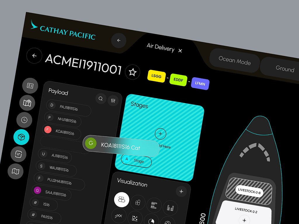
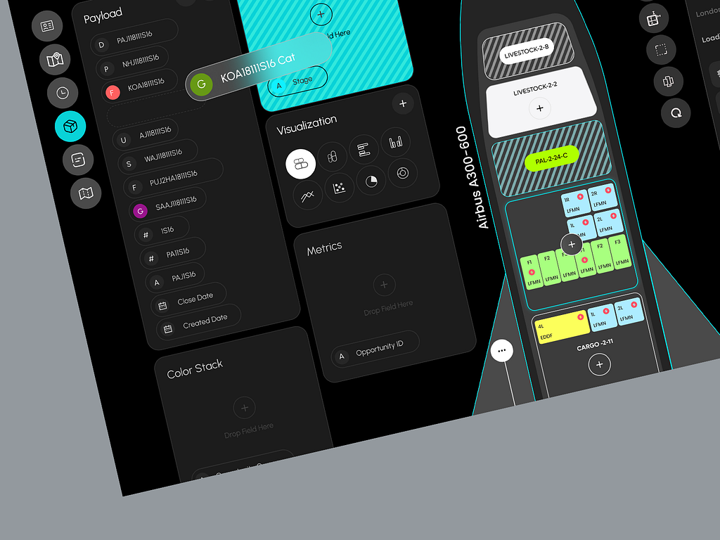
Clear Visualization of Payload:
Detailed Parcel Details:
Easy Payload Management
User-friendly Features
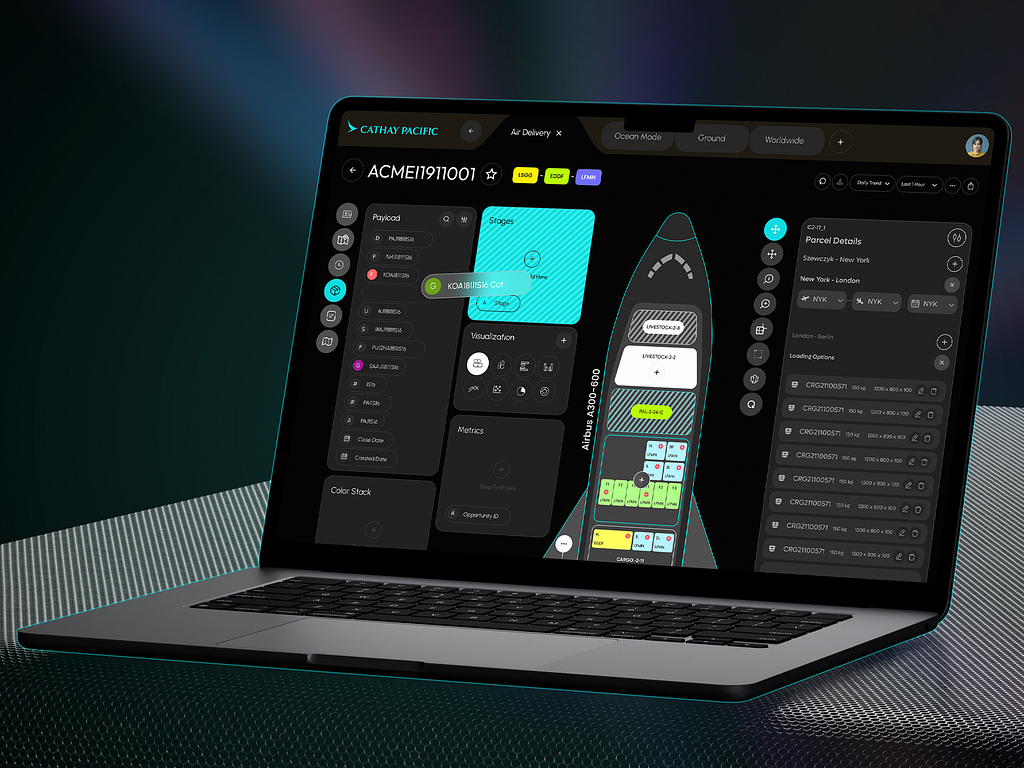
The cargo management and design teams both loved the revamped design, agreeing it was a big improvement. However, one admin, John, suggested adding task management and note-sharing features to help the team collaborate better. There were some other ideas as well that required including more features while maintaining the simplified interface.
I explained that adding these tools might clutter the interface. I also added that given the complexity of the operations it would be better to add them as a separate section later.
This happens every now and then. Especially working with comparatively larger teams there’s always room for improvement. I try to always make necessary changes to satisfy their demands. But sometimes, like in this one, the design requires me to stop at some point.
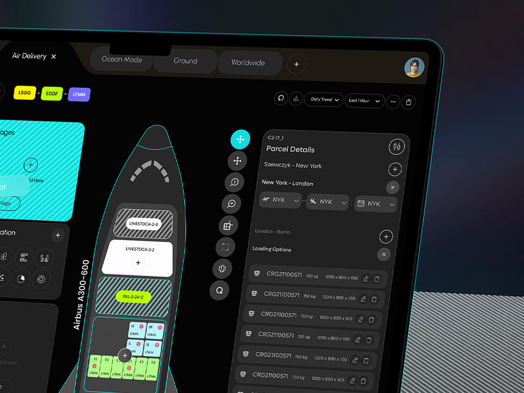
The UI/UX department was happy with the design. But they felt the design could be improved upon with their own team. I handed them my Figma source file. It has my design, which their team can easily edit. I hope that they can come up with what they are looking for and that my design helps them in that direction, maybe as a point of reference or inspiration.
I kept this design in my portfolio because I’m very proud of this design. I think this is an example of how design can simplify a lot of things. Also I really love the aeroplane layout. I keep designs like these in my portfolio to show how each design project is a chance of improvement and it gives a complete picture of my journey.
Need an expert to design your dashboard? Then let’s talk.
PREVIOUS PROJECT
University Hospital Frankfurt - Medical Records dashboardNEXT PROJECT
EerieGG - Roblox gambling site