Dupont equips businesses with advanced financial tools and assists them with navigating their businesses.
The client was searching for a senior-level UI/UX designer who would understand their vision and design a website that resonated with their target audience.

During our first discussion, while the client briefed me about the project, I realised that the challenge was to create something clean and simple while still keeping the design lively and interactive.
After researching some competitors, I wanted to create something that would be both visually unique and welcome users with ease.

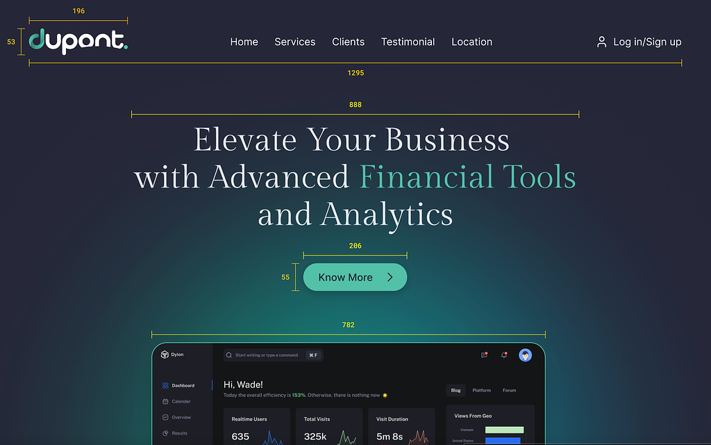
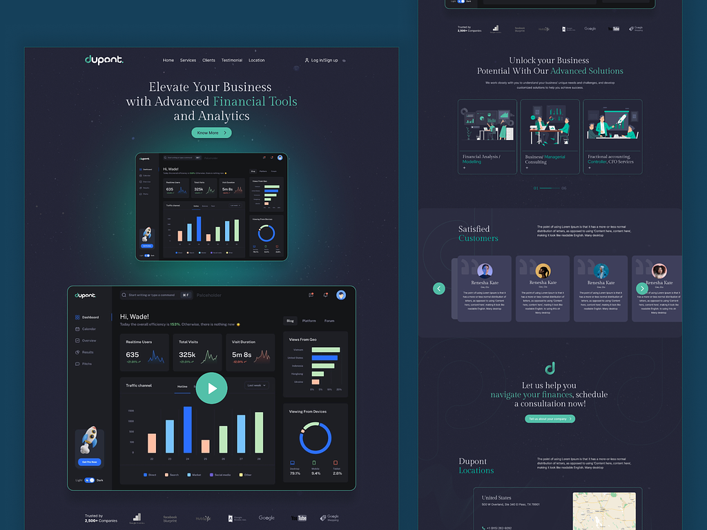
The dashboard in the ‘Hero Section’ conveys a strong brand presence, making an instant connection with viewers. I used Dupont’s video resource to further familiarise the viewers with Dupont’s process.
The graphs and chart graphics make the overall design more lively, but their strategic placement avoids any necessary clutter. They also help represent the services that my client provides.
The final design was designed following the client’s feedback on the mockups. The final design satisfied the client, as they thought it would truly resonate with their audience and users.
Let’s discuss your website homepage!
Book a meeting.
If you need the perfect website that delivers the best user experience while maintaining your brand image, feel free to contact me.
PREVIOUS PROJECT
Libre - website home page design