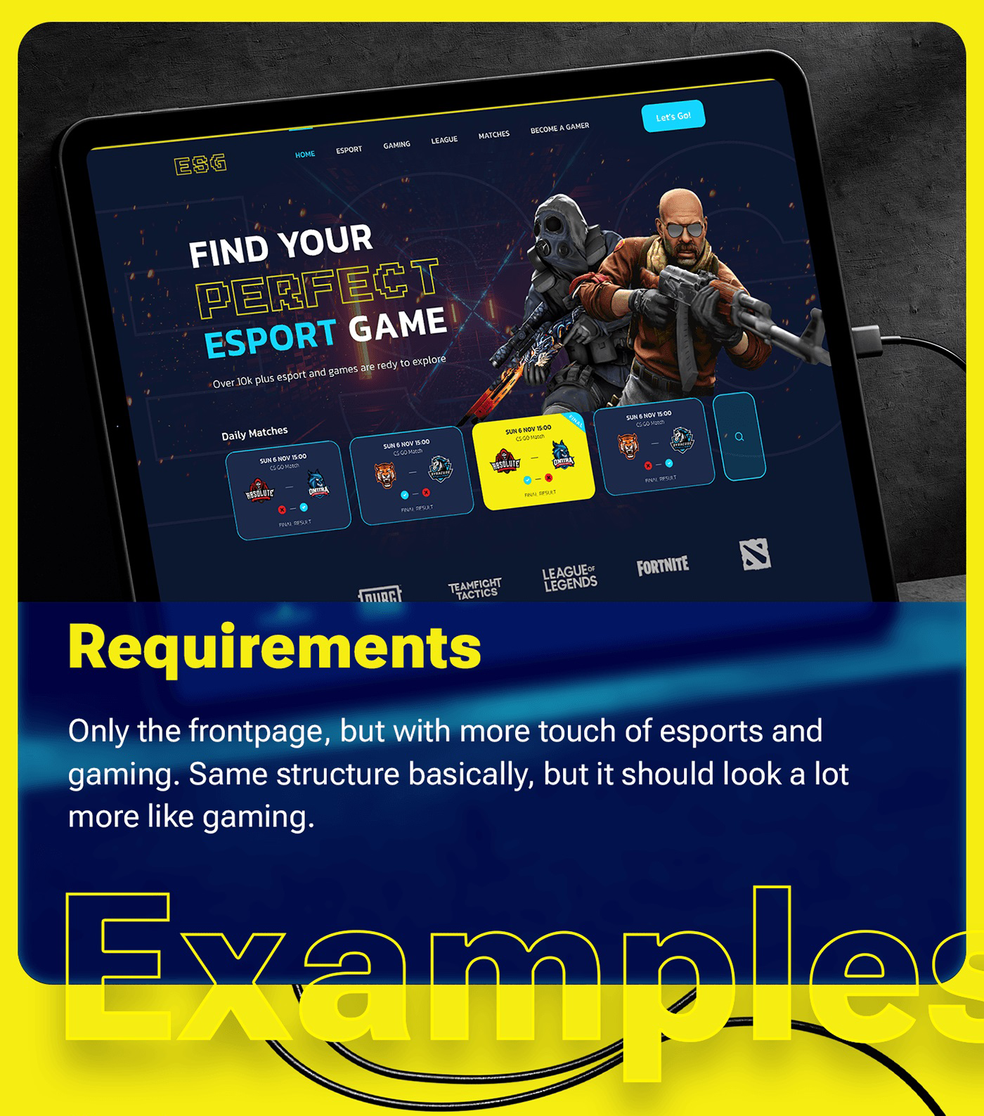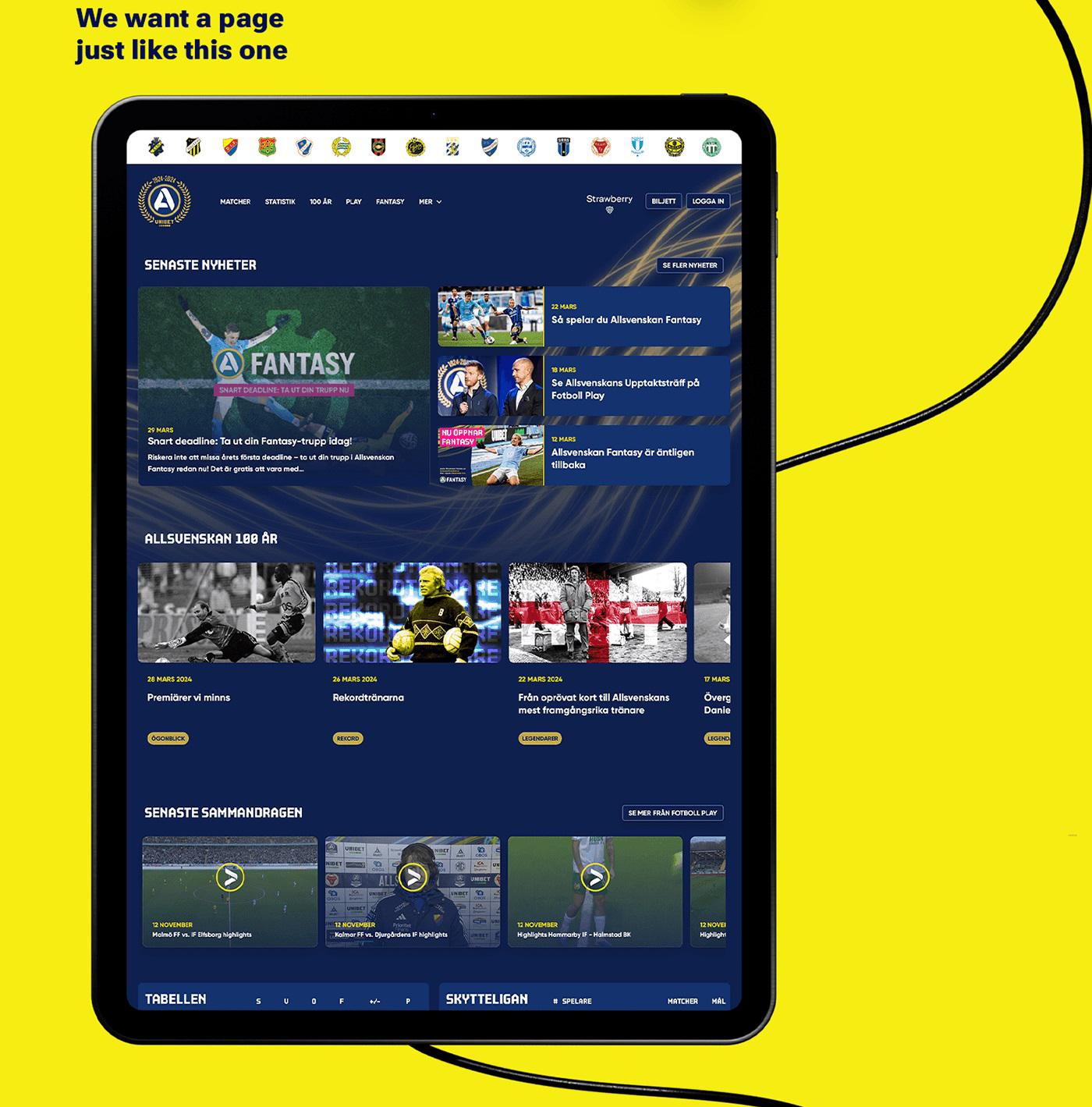
My Swedish clients wanted a homepage design for their new website for CS:GO, one of the biggest professional esports leagues. This new website would host daily matches, keep an updated leaderboard, post relevant news for the gamer community and be a supportive platform for new gamers. During the first meeting of this project, they explained exactly how they wanted the website to look and what design pattern I had to use. For this they used examples of my own previous work that I had designed for them.

Design process becomes easier when you know what your clients want, what they like, and which style they prefer. Designing for old clients is also special as it shows that they trust my judgment, process and creativity. So, I prepared a few mockups that were inspired by the design style my client wanted and the projects they gave as examples. They were already familiar with the process and chose one mockup that suited their style.

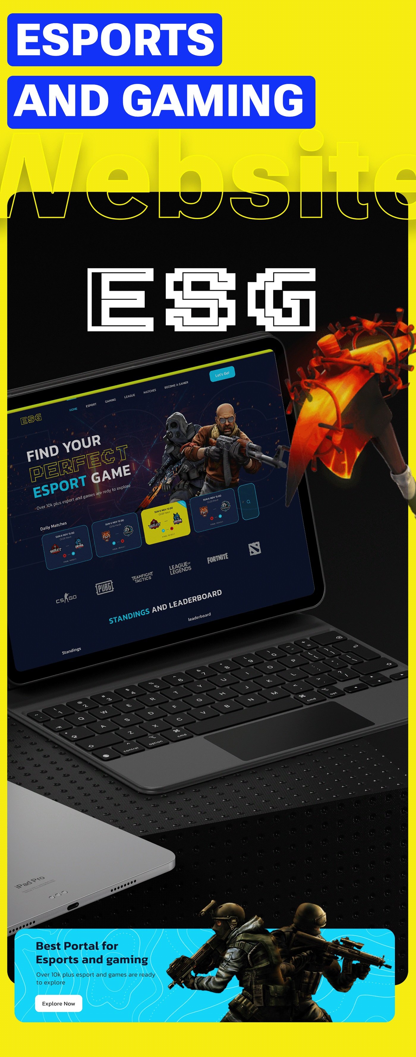
The Hero Section is designed for gamers. The visual on the right shows iconic in-game characters. The heading on the left is inviting and the font colors and styles also match the gaming aesthetic. Multiple sections show the various matches scheduled. This section excites users and encourages them to at least explore the website and at best become a regular participant. The titles of worldwide loved games make it irresistible for gamers.
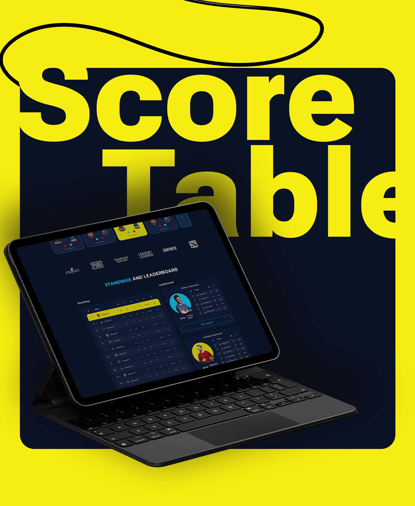
This was a feature that the client specifically asked for. It shows the ranks of players participating from all around the globe. With the current ranking, I also added a Weekly and Monthly Leaderboard that will keep the competition exciting. There are call to action buttons that allow interested users to learn more about the rankings and standings of different teams.
This section introduces the users to the portal formally. Briefly explain their role. The imagery is taken from the gaming world to match the aesthetic and vision of the clients.
The relevant news section keeps users updated about the ongoing trends, and news of the gaming community. This section helps gamers feel a sense of community and brings people together.
The visuals break the boundaries of the section and the brief subtext offers more than 101 games available on the portal. The “explore now” button again tells users to engage and participate in not just a league but the wonderful world of gaming.

The entire website uses visual elements from the esports and gaming world to create a futuristic, modern, tech-savvy aesthetic that matches the theme of gaming. The subtle ESG text behind the hero section adds character to the design.
Building trust is key to making clients return with new projects. Listening to a client's needs, following their preferred style and constantly communicating with them helps me deliver products that they love and use as examples for future projects. Compassion and cooperation builds these relationships and clients all over the world trust me with their projects, just like this one.
Hire an expert designer to design your website homepage!
Book a Meeting!
If you need the perfect website that delivers the best user experience while maintaining your brand image, feel free to contact me.
PREVIOUS PROJECT
Dupont website designNEXT PROJECT
Bonus Life Studio