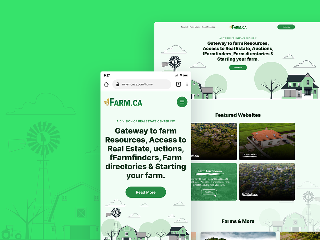
My client needed a stylishly designed interface for their new website for their new division Farm.Ca. This new division is a one stop solution for farm resources, access to real estate, auctions, farm finders, farm directories, or starting someone's own farm.
The challenge of this project was to create a user-friendly, simple layout for a website that serves so many different functions for its users. A minimalist design style was essential to this project.
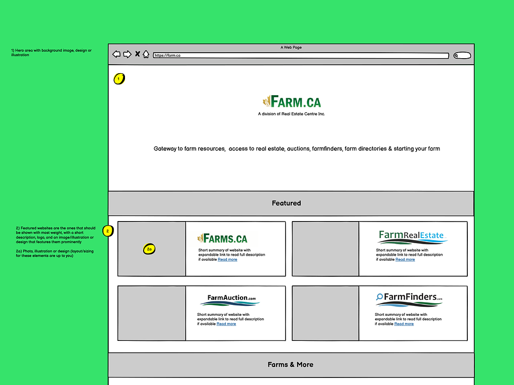
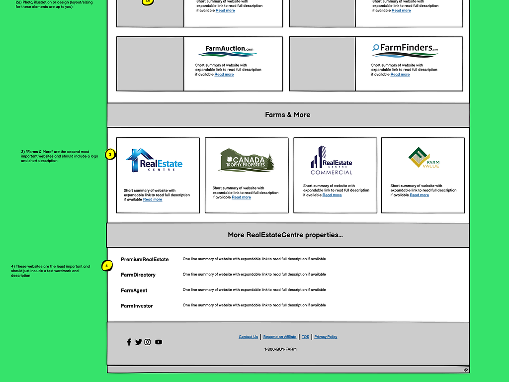
After a thorough research of the industry and discussions with the client, I created a few mockups. 15 years of experience and expert skills helped me turn a simple bland wireframe into an engaging homepage.
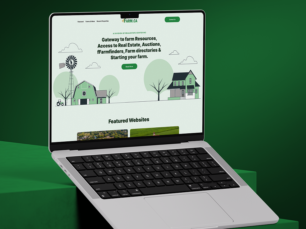
The green and earth tones create a harmonious,simple and soothing backdrop for the entire website. The monogram illustrations and a robust and bold headline creates a strong hero section. The creative imagery welcomes users to explore the many services offered by Farm.Ca.
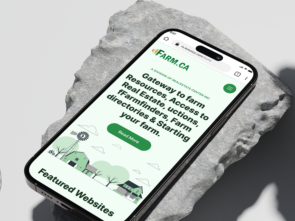
The pastoral beauty of farms and the pragmatic reality of a robust framework of digital real estate— these are two main essence of the website
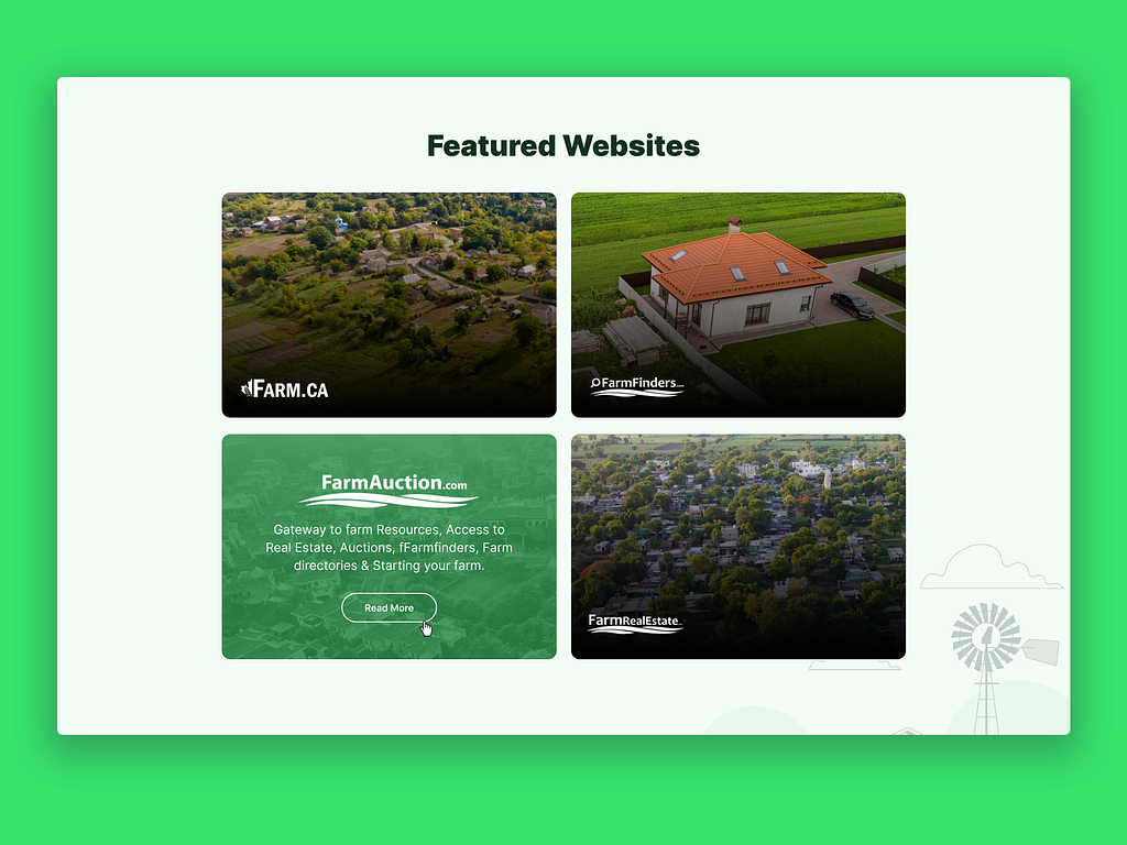
The “Featured Websites” section was designed with pictures of the amazing properties and locations that the client offers. It’s inviting and engaging and with a simple “read more” prompt keeps the user interested.
“Farms & More” section creates a visual interest in the listed site. The beautiful images make sure that smooth navigation doesn’t compromise with aesthetics.
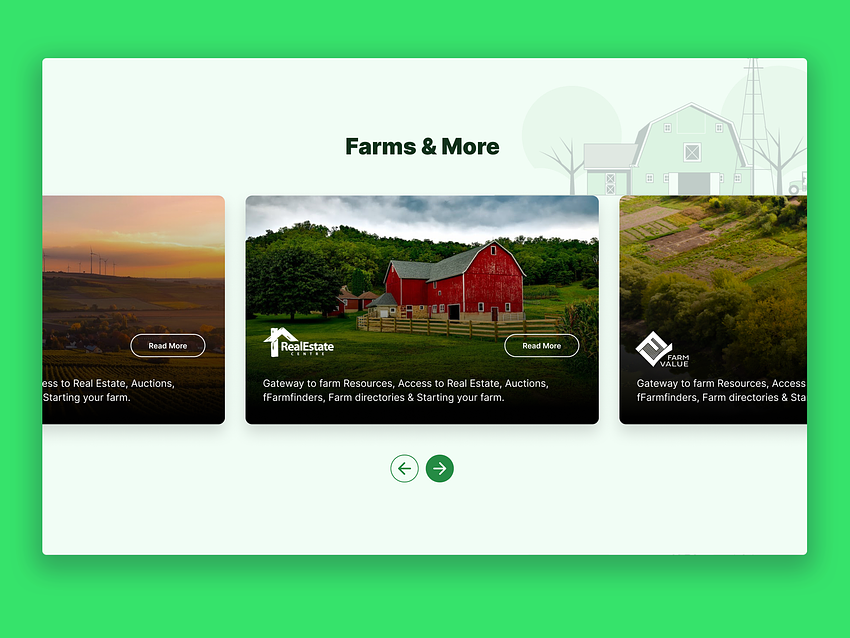
For the websites of lesser focus, I opted for a simple text wordmark to concisely explain their services to the users.
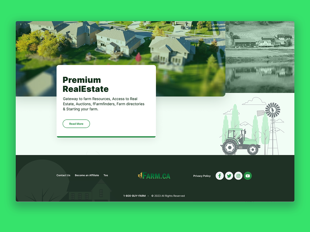
This homepage design has been a wonderful experience. Farm.Ca is not just a website but also a solution for a lifestyle close to nature and growth.
If you need the perfect website that delivers the best user experience while maintaining your brand image, feel free to contact me.
PREVIOUS PROJECT
ICON Financial Website and Landing PageNEXT PROJECT
StarTex Solar